Aqua paint colors are a unique way to invite a refreshing feel into your home with their calming effects and depth of hues. Such paint could create a beautiful, tranquil space that you would love to stay in and enjoy its calming qualities both with loved ones and on your own.
Whether you need a room in your home space where you can unwind and take your needed retreat after a long day, or you just need a fresh feel with cool hues that could get you back on track, we have selected twelve of the best aqua paint colors to create a calming space for you to retreat and gather up new energy.
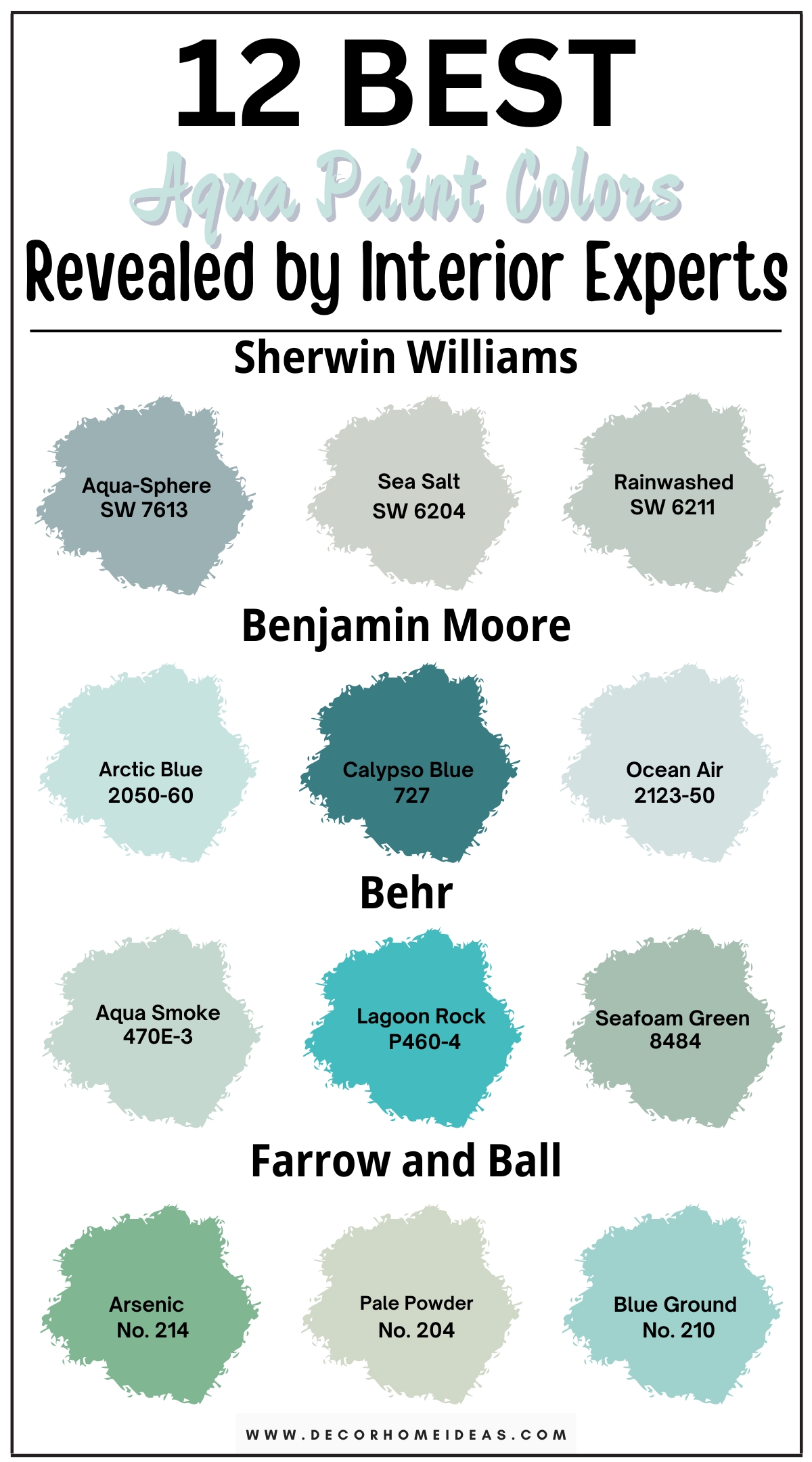
1. Sherwin Williams
Sherwin Williams Aqua-Sphere
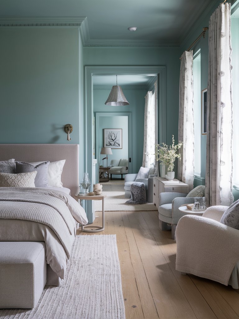
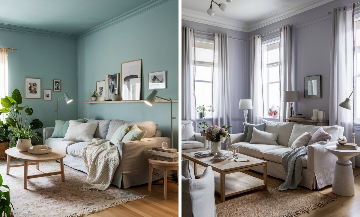
Sherwin Williams’ Aqua-Sphere is a pastel aqua paint color with light, creamy undertones that could create a beautiful atmosphere of serenity and softness in your home space. It could be the perfect fit for a more intimate room, such as a bedroom, where you can unwind after a long, exhausting day.
Opt for gray bedding with light blue decorations to complement the paint and add more blue decorative elements to capture the softness of the color. Focus on pale wood nightstands and small tables, and follow the gray theme by choosing gray armchairs, carpets, and curtains for a chill area where you can feel the relaxing hues.
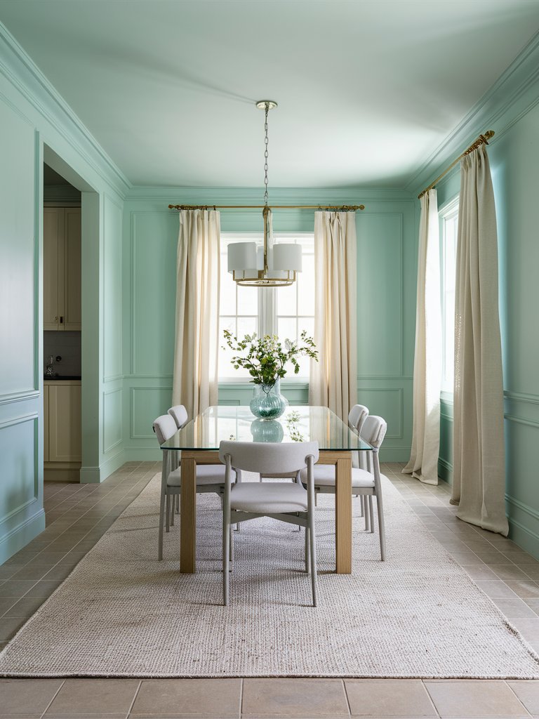
Sherwin Williams Sea Salt
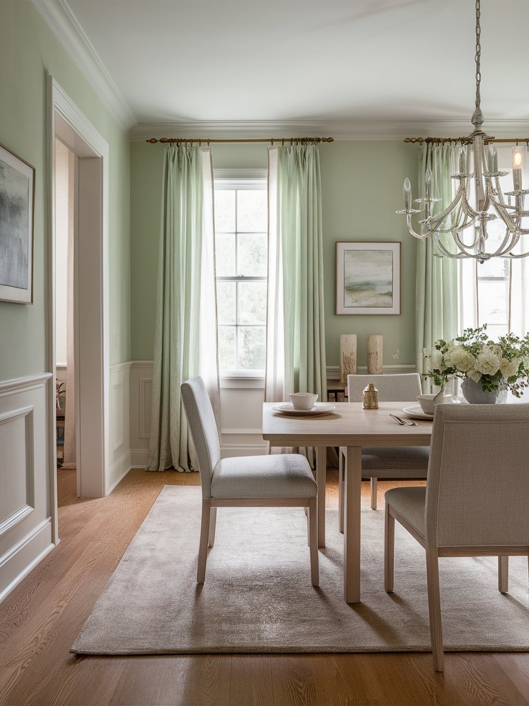
Sherwin Williams’ Sea Salt is a cool aqua paint color with muted green undertones that could make every day feel like a relaxing beach day, enhancing your home space with a unique, tranquil energy. It could fit very well in a social room like a dining room, where you can enjoy quality time with your loved ones.
If you want to achieve a cleaner look, you can integrate a white wainscoting to create a beautiful, harmonizing effect that will further bring the aqua paint to focus. Opt for gray, beige, and pale wood furniture to capture the softness of the paint, and add light green curtains to complement it and create a nice frame to the room.
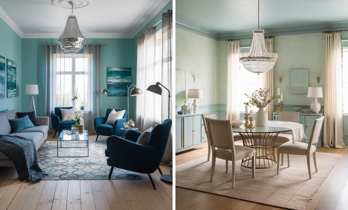
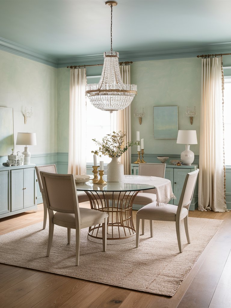
Sherwin Williams Rainwashed
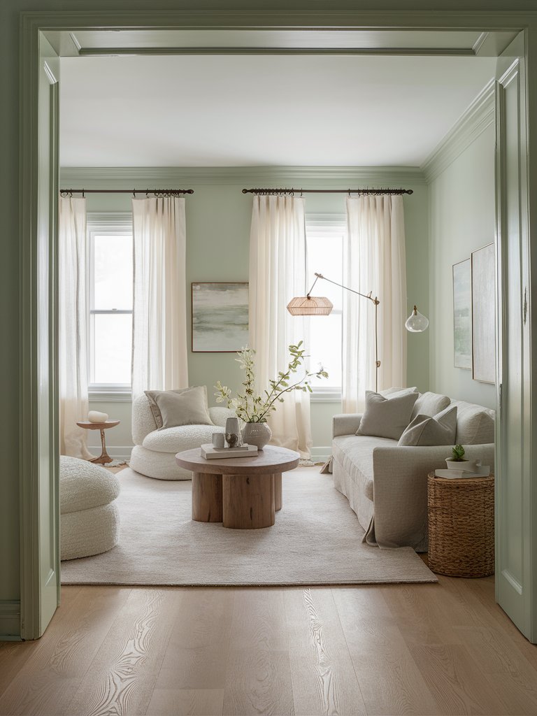
Sherwin Williams’ Rainwashed is a light aqua paint color with airy green undertones that could bring a serene and natural feel to your home space. If you want to achieve a refreshing, all-encompassing, tranquil feel in your home, you can integrate this color into a social room, like a living room.
Rainwashed could go on really well with a modern living room design – opt for plush, white or beige sofas and armchairs, a pale wood coffee table, and rattan elements like a side table, or a storage box to invite a natural, earthy feel in the room. Choose ceramic or glass decorations like vases and trays to evoke a sense of elegance.
2. Benjamin Moore
Benjamin Moore Arctic Blue
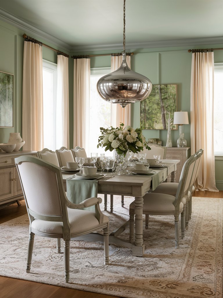
Benjamin Moore’s Arctic Blue is a light aqua paint color with eye-pleasing green undertones that could create a refreshing, natural feel in your home space with its soft and airy appearance. Therefore, it could be the perfect choice for a gathering room, such as a dining room, where you can spend quality time with your guests.
Focus on beige as a main furniture color – choose beige chairs, carpets, and curtains to create a nice frame around the room and bring the aqua paint forth through a neutral color. You can also add a glass dining table and other glass decorative elements that would nicely complement and enhance the airy feel of the room.
Benjamin Moore Calypso Blue
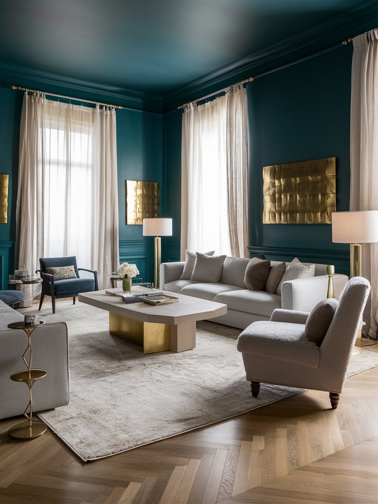
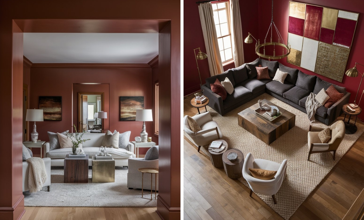
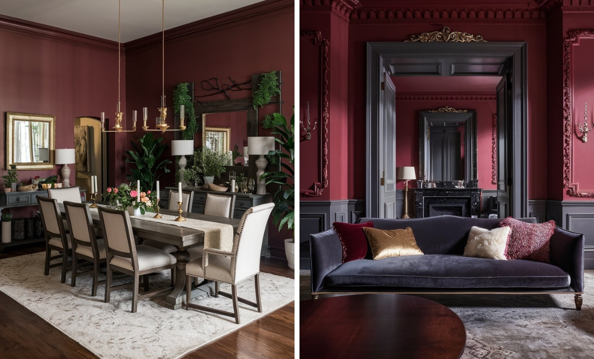
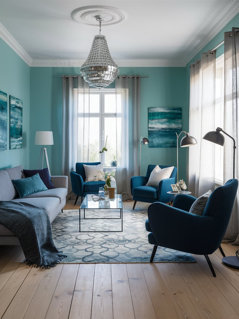
Benjamin Moore’s Calypso Blue is a rich aqua paint color with deep blue undertones that could infuse a space with festive flair and sophisticated drama. Therefore, it could be the perfect choice for a social room, such as a living room, to gather your guests around for meaningful, deep conversations.
Such deep paint colors could be best combined with gray furniture like sofas and armchairs, with an accent dark blue armchair to complement the paint. Choose unique golden decorative elements like a side table, lamp bases, or big wall motifs to create a rich, elegant feel that could enhance the room’s grace.
Benjamin Moore Ocean Air
Benjamin Moore’s Ocean Air is a pale aqua paint color with creamy green undertones that could instantly create a soothing feel in your home space, straying away from every worry. It could fit best in a gathering room, like a dining room, where you can spend some beautiful time with your family and friends over a delicious meal.
You can add some counters and shelves around the walls and paint them in the same aqua color for extra storage space and as a stylish addition to your dining room. Focus on beige chairs, carpets, and curtains to enhance the softness of the paint and add a glass dining table to follow a clean aesthetic.
3. Behr
Behr Aqua Smoke
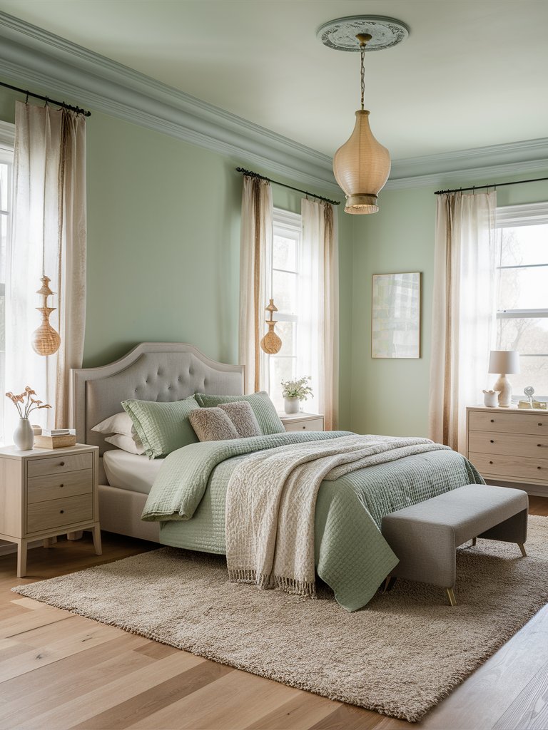
Behr’s Aqua Smoke is a creamy aqua paint color with soft green undertones that could enhance your home space with a natural, airy feel while providing it with a unique softness. It could fit best in an intimate room like a bedroom to create the perfect place for unwinding and relaxation.
Opt for neutral furniture like pale wood nightstands and drawers, together with creamy and textured carpets and curtains for a soft feel. Choose soothing bedding with accent light green decorative pillows and throw blankets to complement the paint and create a tranquil space where you can rest and unwind.
Behr Lagoon Rock
Behr’s Lagoon Rock is a refreshing aqua paint color with creamy blue tinges that could remind you of soft waves and sea foam for a soothing feel of tranquility. Therefore, it could suit best in a gathering room, such as a living room, where you can share this relaxing experience with your loved ones over a steamy cup of coffee.
To achieve a sense of depth to complete the ocean representation, you can add a gray sofa with accent dark blue armchairs that would be the main focus in the room, enhancing its refined style. Add a subtle glass coffee table and hang some paintings with a depiction of an ocean to capture the room’s sensory effect.
Behr Seafoam Green
Behr’s Seafoam Green is a gentle aqua paint color with creamy hues that could create a soothing atmosphere of cool charm in your home space. Therefore, it could be the perfect choice for a social room like a dining room to evoke a sense of togetherness and a grounding, cool energy to share with your friends and family.
Such a gentle paint color is perfect for a vintage interior design – ornamented drawers and chairs, a solid wooden table with beautiful details, and a vintage carpet with intriguing decorations on it. You can add a silver or copper light above the table to create a stylish focal point. Make sure to keep a fresh bouquet in the room to capture the natural feel.
4. Farrow and Ball
Farrow and Ball Arsenic
Farrow and Ball’s Arsenic is a lively aqua paint color with soft green undertones that could invite a refreshing and soothing ambiance in your home space. It could be the perfect choice for a social room, like a living room, to ease your guests into a refreshing, airy ambiance to make them feel welcome.
The paint color is lively and intriguing, so you can rely on a playful, modern design involving patterns and different textures to create a beautiful effect in your living room. You can add a patterned armchair and carpet, and some golden or ceramic decorative elements to enhance the elegance and charm of the room.
Farrow and Ball Pale Powder
Farrow and Ball’s Pale Powder is a popular aqua paint color with soft gray undertones that has an unparalleled softness and a delicate feel to it that could enhance your home’s elegance and charm. Therefore, it could fit well in a gathering room, such as a dining room, to evoke beautiful emotions and compliments from your guests.
Opt for a modern look with gray chairs and a pale wood dining table to enhance the soothing effect. Add a unique patterned carpet and soft beige curtains to invite a sense of refined elegance. Choose golden elements like a big chandelier as a focal point and spread some greenery around the room for a natural, refreshing feel.
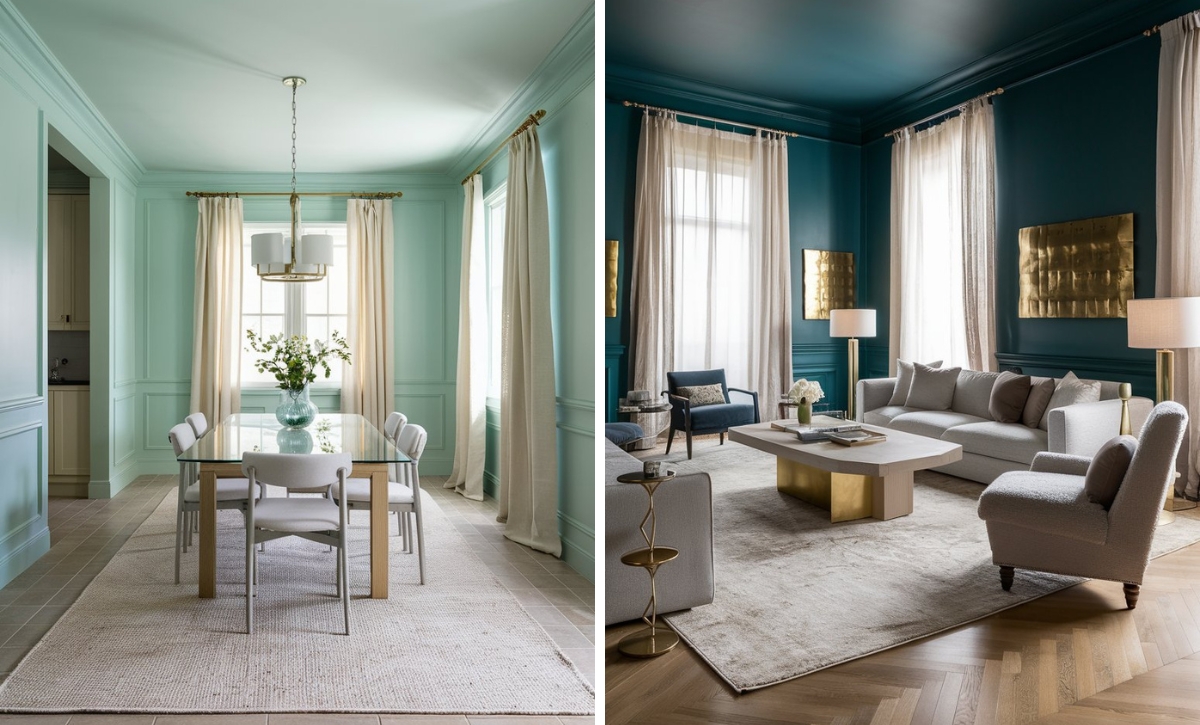
Farrow and Ball Blue Ground
Farrow and Ball’s Blue Ground is a clean aqua paint color with light blue undertones that could create an upbeat and happy atmosphere in your home space for an optimistic vibe. It is an inviting color, making it the perfect choice for a social room, such as a living room, where you can gather with your loved ones in a tranquil ambiance.
Opt for a gray corner sofa with beige armchairs and a small, simple coffee table to create a minimalistic, yet cozy look. Spread some potted plants and greenery around the room to enhance its refreshing feel, and hang pictures on the walls as a finishing touch to the clean aesthetic of your living room.
What Color Compliments Aqua Colors?
- Coral
- Warm Gray
- Soft White
- Navy Blue
- Sunny Yellow
Coral
Coral is a vibrant and warm contrast to aqua, creating an energetic and tropical vibe. This pairing is perfect for spaces like living rooms, bedrooms, or outdoor areas where you want to evoke a playful and lively atmosphere.
Use coral in accent pillows, artwork, or decorative pieces to bring warmth and a splash of color that balances the cool freshness of aqua.
Warm Gray
Warm gray offers a neutral, calming balance to the bright and refreshing nature of aqua. This combination creates a serene and sophisticated palette, making it ideal for bathrooms, bedrooms, or contemporary living spaces.
Incorporate warm gray in furniture, rugs, or wall accents to ground the space and create a harmonious contrast with aqua.
Soft White
Soft white provides a crisp, clean contrast to aqua, keeping the space light and airy. This pairing works beautifully in kitchens, bathrooms, or coastal-themed rooms, where a fresh and bright atmosphere is desired.
Use soft white in cabinetry, trim, or larger furniture pieces to create an open and refreshing backdrop that complements aqua’s cool tones.
Navy Blue
Navy blue adds depth and richness to aqua, creating a striking and sophisticated contrast. The deep tones of navy balance the brightness of aqua, making this combination perfect for living rooms or dining areas where a bold, modern aesthetic is desired.
Use navy blue in accent furniture, rugs, or décor to create a dramatic, yet balanced look that complements aqua’s refreshing hue.
Sunny Yellow
Sunny yellow brings a cheerful and lively complement to aqua, evoking a bright and energetic vibe. This combination is ideal for playful spaces like kids’ rooms, kitchens, or sunrooms, where you want to infuse warmth and fun.
Incorporate sunny yellow in decorative accents, textiles, or artwork to add a bold, warm contrast that enhances the fresh, light feel of aqua.
Color Disclaimer
Please note that all paint colors displayed on this page are for illustrative purposes only. Due to variations in screen settings, lighting, and other factors, the colors you see on your screen may differ from the actual paint colors. We recommend viewing a physical color sample or swatch for the most accurate representation. Some images might be generated by AI to represent paint colors in different interiors