Warm paint colors tend to evoke feelings of deep coziness and comfort in a home space. Their soft hues could bring a sense of warmth and soothing energy, making your home the perfect space to unwind and regain your energy. We have selected twelve of the best warm paint colors to draw inspiration from for the cozy atmosphere of your home space.
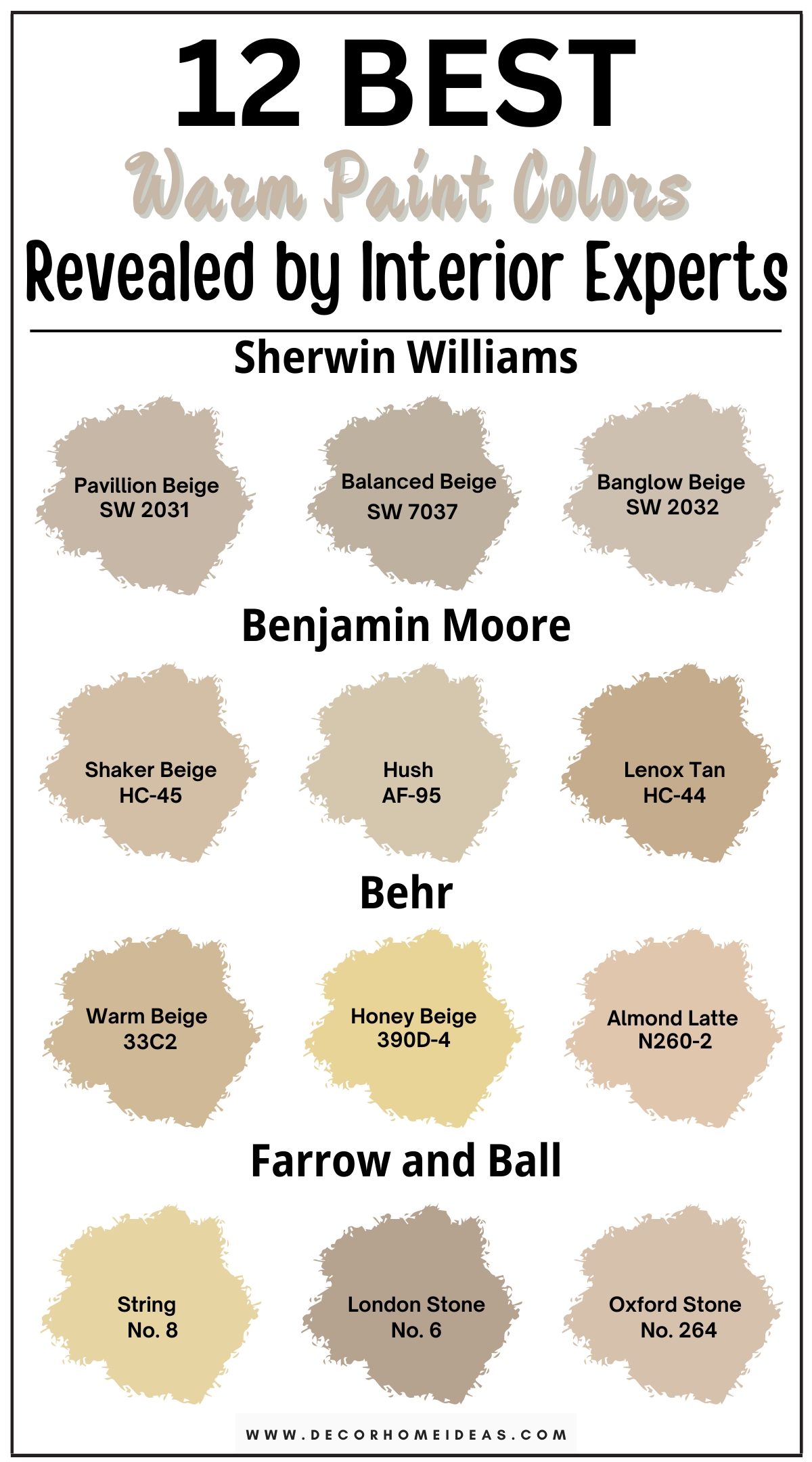
The article’s focus is on warm beiges, peach, or terracotta shades to create an earthy, comforting space. You can integrate lighter shades in your home space for a more optimistic and welcoming ambiance, and focus on darker shades for a sense of sophistication, refined elegance, and utter calm.
1. Sherwin-Williams
Sherwin-Williams Pavilion Beige
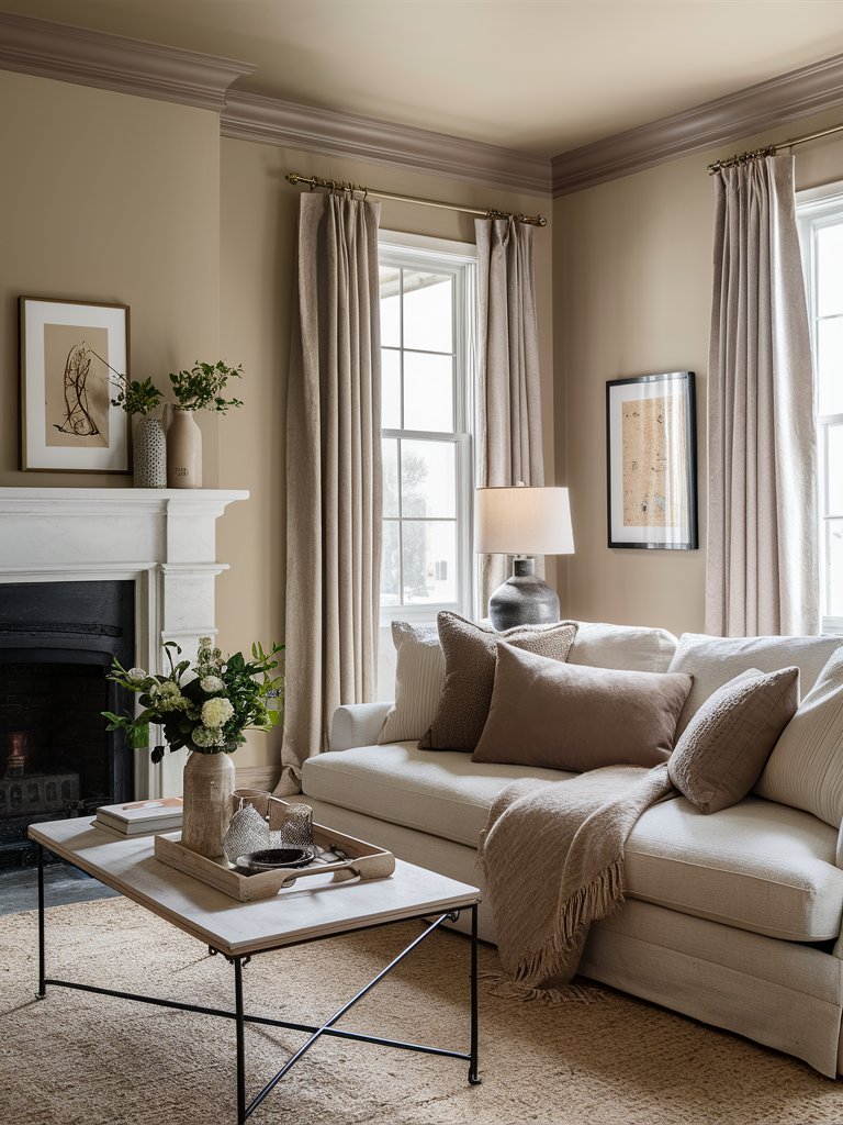
Sherwin-Williams’ Pavilion Beige is a medium warm beige paint color with pale gray undertones that could give your space a dose of both lively energy and relaxation due to its warm appearance. Therefore, it could be the perfect fit for a gathering room, like a living room, where you best feel its charm.
This paint color pairs extremely well with other warm neutrals, so you can integrate a soft white sofa with warm brown decorative pillows and beige carpets and curtains to frame the room in warmth. Add simple ceramic, glass, and golden decorations to enhance the room’s refined elegance and its charm.
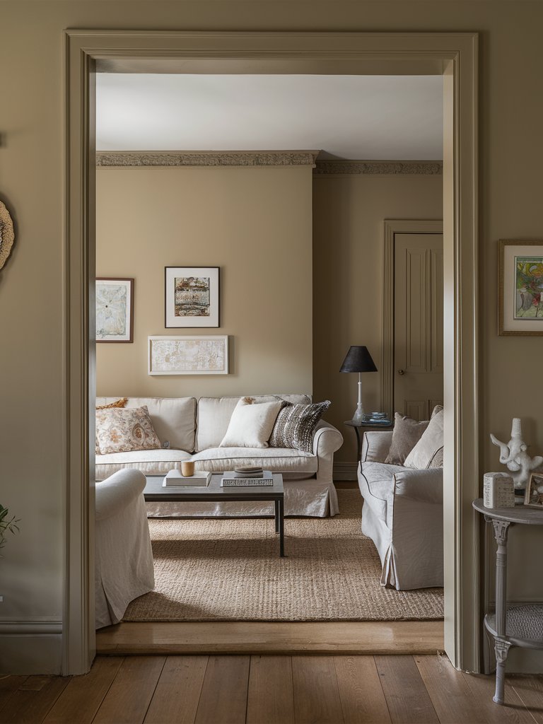
Sherwin-Williams Balanced Beige
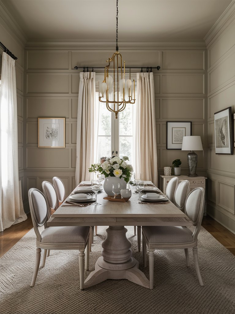
Sherwin-Williams’ Balanced Beige is a soft beige paint color with a true balance of warm and cool tones that could adapt well to almost any setting in your home space. You can consider integrating it into your dining room to create an inviting setting and undeniable charm with the paint’s soft appearance.
Follow a neutral color pattern for the room’s interior design – choose an ornamented pale wood dining table and drawers, together with white or beige chairs to create a soothing feel. Add ceramic decoration elements, soft, warm-colored curtains, and a golden chandelier for a sense of refined elegance.
Sherwin-Williams Bunglow Beige
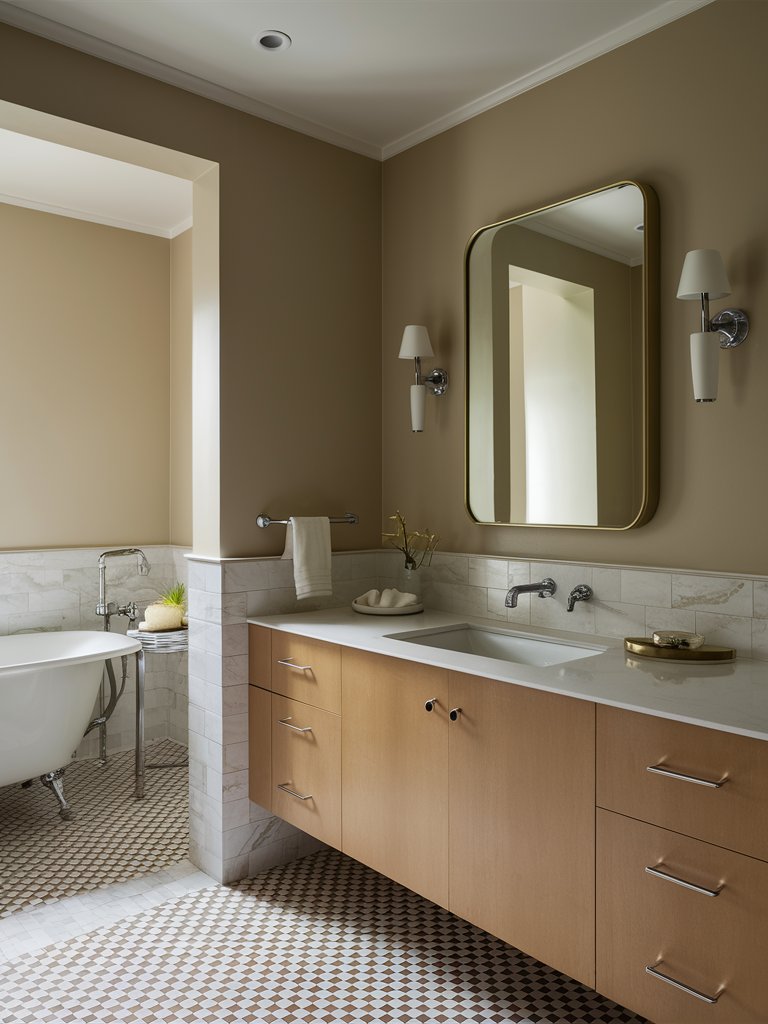
Sherwin-Williams’ Bungalow Beige is a light beige paint color with warm brown undertones that could invite a charming feel in your home space due to its warmth. Therefore, it can fit well in a bathroom to invite a subtle energy that will create a relaxing space for you in the quietest and most intimate times of day.
Opt for a half-wall tiling, preferably in a soft white or gray color, for both functionality and high style in your bathroom area. Choose a pale wood bathroom vanity with a glazed white countertop to match the paint’s warmth and add subtle golden and ceramic decoration elements like trays, vases, and sconces as a charming finishing touch.
2. Benjamin Moore
Benjamin Moore Shaker Beige
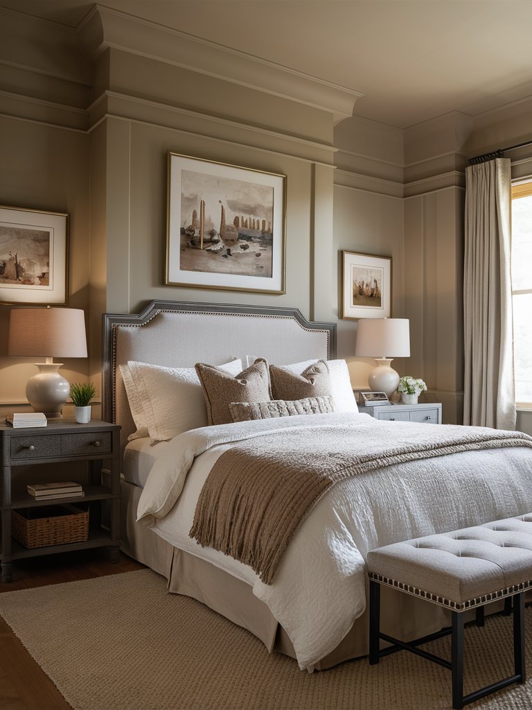
Benjamin Moore’s Shaker Beige is a quintessential beige neutral with pale undertones that could exude a sense of simple elegance and comfort in your home space. It could be the perfect choice for a more intimate room, such as a bedroom, where you can reap its benefits in your most relaxing space.
Opt for neutral bedding with darker brown decorative pillows and throw blankets to capture the paint’s warmth. You can also add darker wood nightstands to invite a sense of sophistication into your bedroom. Hang some aesthetically pleasing paintings on the wall and add ceramic decoration elements as nice finishing touches.
Benjamin Moore Hush
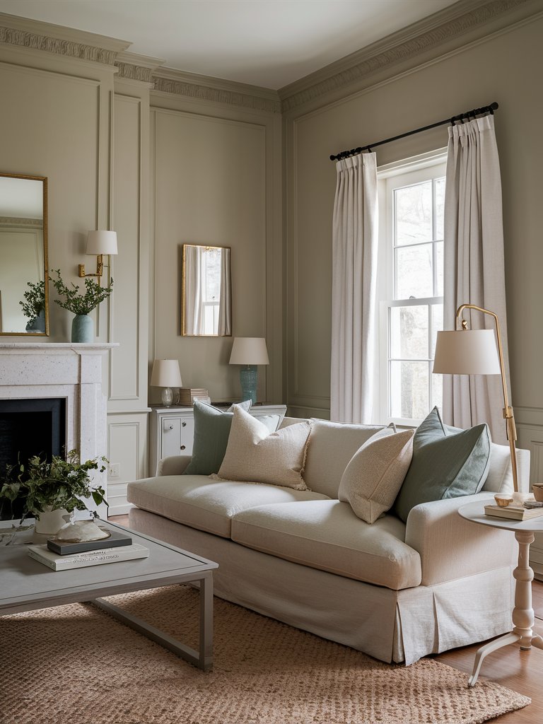
Benjamin Moore’s Hush is a neutral paint color with light olive green undertones that could create a quiet demeanor in your home space, predisposing to comfort and an elegant sense of coziness. Therefore, it could be the perfect choice for a social room, like a living room, where you can relax after a long, exhausting day.
Opt for white sofas and armchairs with accent decorative pillows in gray and olive colors to capture the paint’s charm. Choose a white or gray coffee table, drawers, and side tables for a soothing effect, and add ceramic and golden decoration elements to enhance your living room’s visual appeal and refined aesthetic.
Benjamin Moore Lenox Tan
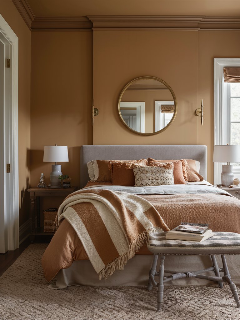
Benjamin Moore’s Lenox Tan is an appealing khaki paint color with creamy terracotta undertones that strikes a balance between classic comfort and modern-day elegance. It could fit best in an intimate room like a bedroom, where it can exude its warmth and charming energy for the perfect unwinding spot.
Such paint colors are really compatible with neutral colors like gray and pale wood furniture, so you can focus on gray bedding with accent terracotta decorative pillows and throw blankets to complement the paint. Choose pale wood nightstands and golden decoration elements for an elegant, charming feel.
3. Behr
Behr Warm Beige
Behr’s Warm Beige is a light beige paint color with slight peach undertones that could create a unique sense of warmth and elegance in your home space. Therefore, it could fit perfectly in a gathering room, such as a living room, where it can evoke an inviting atmosphere for your guests and yourself.
This paint color could go extremely well with a neutral color palette for the furniture, like white, beige, and brown. Integrate the matching colors by adding decorative pillows and throw blankets to capture the room’s charm. Choose ceramic and golden decoration elements as an elegant finishing touch.
Behr Honey Beige
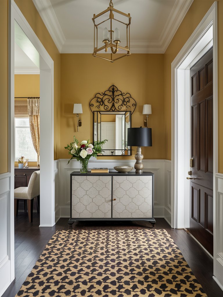
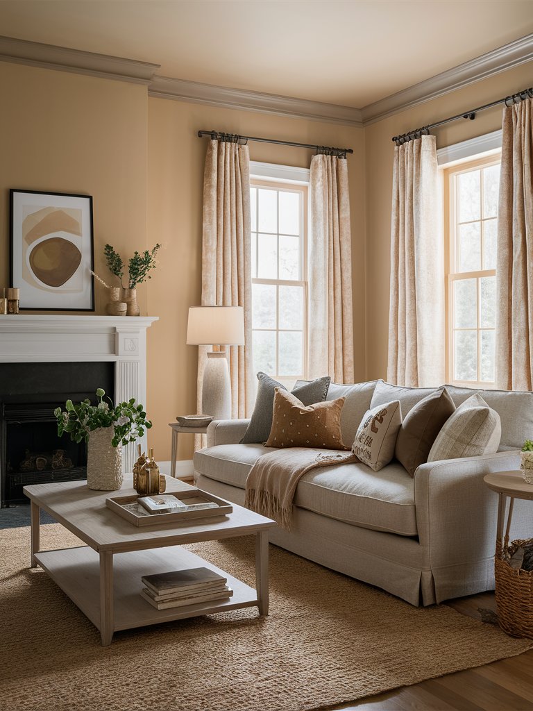
Behr’s Honey Beige is a rich neutral paint color with mustard undertones that could create a sense of cheerfulness and refined elegance in your home space. It could be the perfect choice for an entryway as a welcoming way to set your guests’ first impressions of your home space in a cozy, charming way.
Integrate pure white wainscoting in the entryway to combine it with the mustard neutral for a joyous, balanced effect. Opt for patterned interior elements like a beige, patterned carpet and console table for a cheerful ambiance. Add ceramic and golden elements to invite a sense of refined elegance into your entryway.
Behr Almond Latte
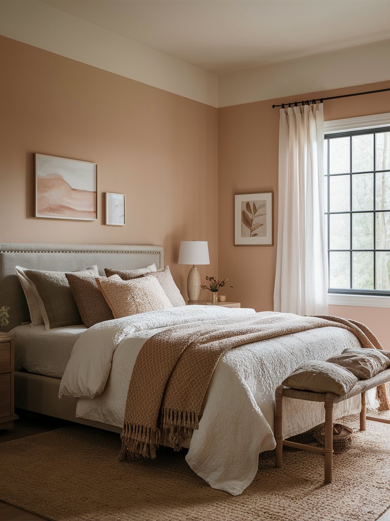
Behr’s Almond Latte is a warm beige paint color with light terracotta undertones that could enhance the coziness and the comforting energy in your home space. It could fit extremely well in a more intimate room, such as a bedroom, where you can feel its healing, enriching effects.
Opt for neutral bedding in beige and focus on an abundance of decorative pillows in a warm brown color for a sense of heightened comfort and relaxation. Focus on rattan elements like a rattan bed bench, and some storage boxes to invite a natural, earthy feel in your bedroom, and make sure to choose ceramic decoration elements as an elegant finishing touch.
4. Farrow and Ball
Farrow and Ball String
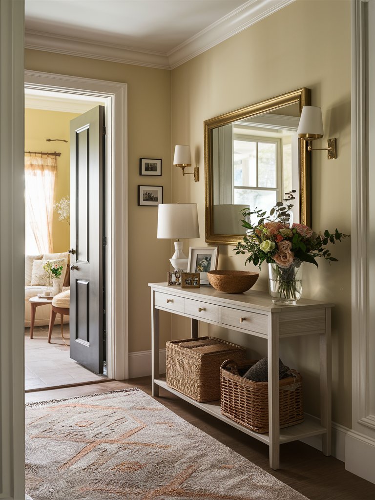
Farrow and Ball’s String is an earthy yellow-based neutral paint color with beige undertones that could create a sense of comfort and relaxation in your home space. It could fit well in an entryway, showcasing your home’s unique, earthy ambiance and the coziness that goes hand in hand with it.
Match the String paint with a pure white color for the door bases and cornices for a beautiful, balanced frame. Choose a simple gray console table with rattan storage boxes underneath for an enhanced earthy feel and a refreshing energy. You can also add golden decoration elements, like sconces and a mirror frame, for a sense of refined elegance and charm.
Farrow and Ball London Stone
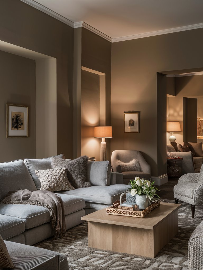
Farrow and Ball’s London Stone is a warm neutral paint color with creamy brown undertones that exudes timeless charm and a sense of coziness. This paint could go really well in a gathering room, such as a living room, where you can spend quality time with your friends and family, embraced by a homely feel.
This paint matches really well with gray furniture, so you can focus on gray sofas and armchairs with fluffy decorative pillows for extra coziness and comfort. Choose a pale wood coffee table and similar side tables to create an earthy, relaxing feel, and add ceramic and rattan decoration elements for a refreshing energy.
Farrow and Ball Oxford Stone
Farrow and Ball’s Oxford Stone is a warm neutral paint color with soft beige undertones that was inspired by the pretty Cotswold villages of Oxfordshire. It has a unique sense of warmth and exudes feelings of comfort and coziness, making it the perfect choice for a social room, like a living room.
Choose comfortable white sofas and armchairs with abundant decorative pillows and throw blankets to enhance the cozy feel. If you want an effortlessly elegant look, you can integrate ornamented cornices painted in the same color for a depth in design. Make sure to add ceramic decoration elements to enhance the living room’s visual appeal.

What Color Compliments Warm Colors?
- Cool Gray
- Teal
- Crisp White
- Navy Blue
Cool Gray
Cool gray provides a modern and balanced contrast to warm colors, such as reds, oranges, and yellows. This combination creates a sophisticated and calming effect, perfect for contemporary spaces like living rooms or offices.
Incorporate cool gray in furniture, accent walls, or textiles to tone down the intensity of warm colors while maintaining a cohesive look.
Teal
Teal offers a refreshing and vibrant contrast to warm colors, adding a pop of cool tones that complement the richness of reds, oranges, or warm browns. This pairing brings energy and vibrancy to spaces like kitchens, dining rooms, or creative spaces.
Use teal in accent pillows, artwork, or decorative pieces to create an inviting and lively atmosphere that balances the warmth of the primary palette.
Crisp White
Crisp white creates a clean and fresh contrast to warm colors, allowing them to shine while keeping the space light and airy. This combination works well in any room where you want to enhance brightness and maintain a welcoming vibe.
Use crisp white in walls, cabinetry, or trim to create a bright backdrop that highlights the warmth of your accent colors.
Navy Blue
Navy blue offers a deep and rich contrast to warm colors, adding depth and sophistication. This pairing is perfect for living rooms, dining rooms, or bedrooms where you want to create a bold yet balanced aesthetic.
Incorporate navy blue in furniture, rugs, or accent pieces to create a striking contrast that elevates the richness of warm hues.
Color Disclaimer
Please note that all paint colors displayed on this page are for illustrative purposes only. Due to variations in screen settings, lighting, and other factors, the colors you see on your screen may differ from the actual paint colors. We recommend viewing a physical color sample or swatch for the most accurate representation. Some images might be generated by AI to represent paint colors in different interiors