If you are currently doing a makeover in your home or you just want to bring a refreshing color into it, you can draw inspiration from these trendy paint colors that can transform your home space.
We have compiled twelve of the best paint colors, including shades like dusty pink, pastel beige, and cool blue tones to present a variety to any personal style.
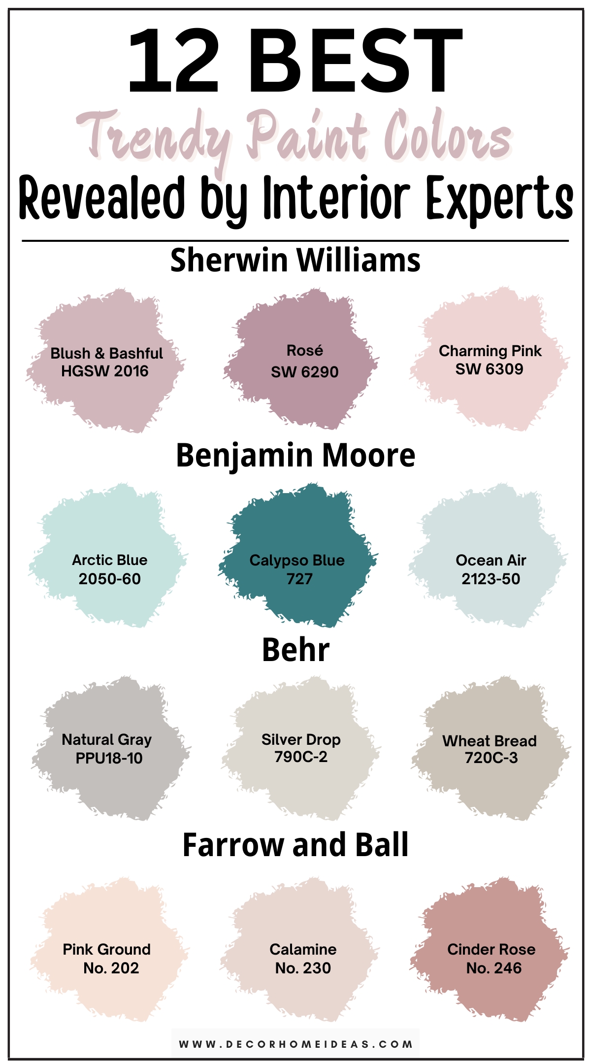
In case you want to evoke a soft, nurturing ambiance in your home, you can rely on the pastel pink and beige paint colors of this list. On the other hand, if you crave a serene and refreshing atmosphere, the cool blue shades are the perfect ones for you and your home style.
1. Sherwin Williams
Sherwin Williams Blush & Bashful
Sherwin Williams’ Blush and Bashful is a pale pink paint color with light pastel undertones that could create a soothing atmosphere in your home space with its softness of color. Therefore, it could be the perfect choice for a more intimate room like a bedroom, where you can feel its relaxing effect and unwind.
Opt for light-coloured neutral furniture with accent dust pink elements like decorative pillows to complement the paint. Choose subtle gilded nightstands for a stylish feel and other small elements like lamps and trays that go well with the overall design. By adding textured curtains in soft colors, you can create a soothing finishing touch.
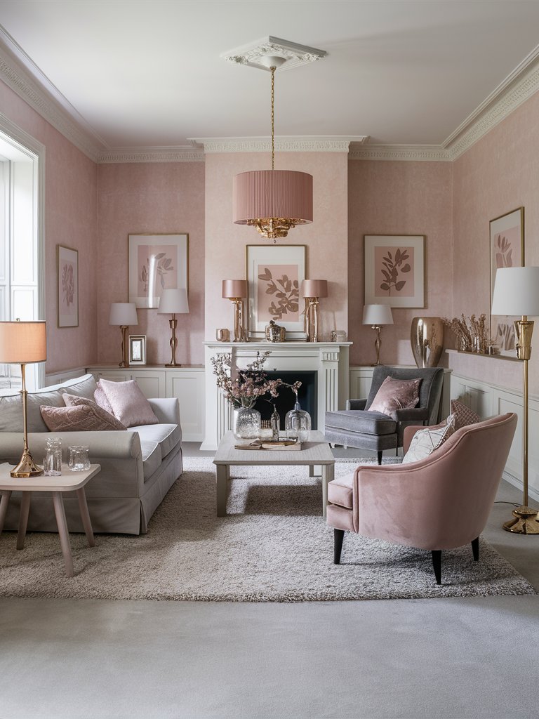
Sherwin Williams Rosé
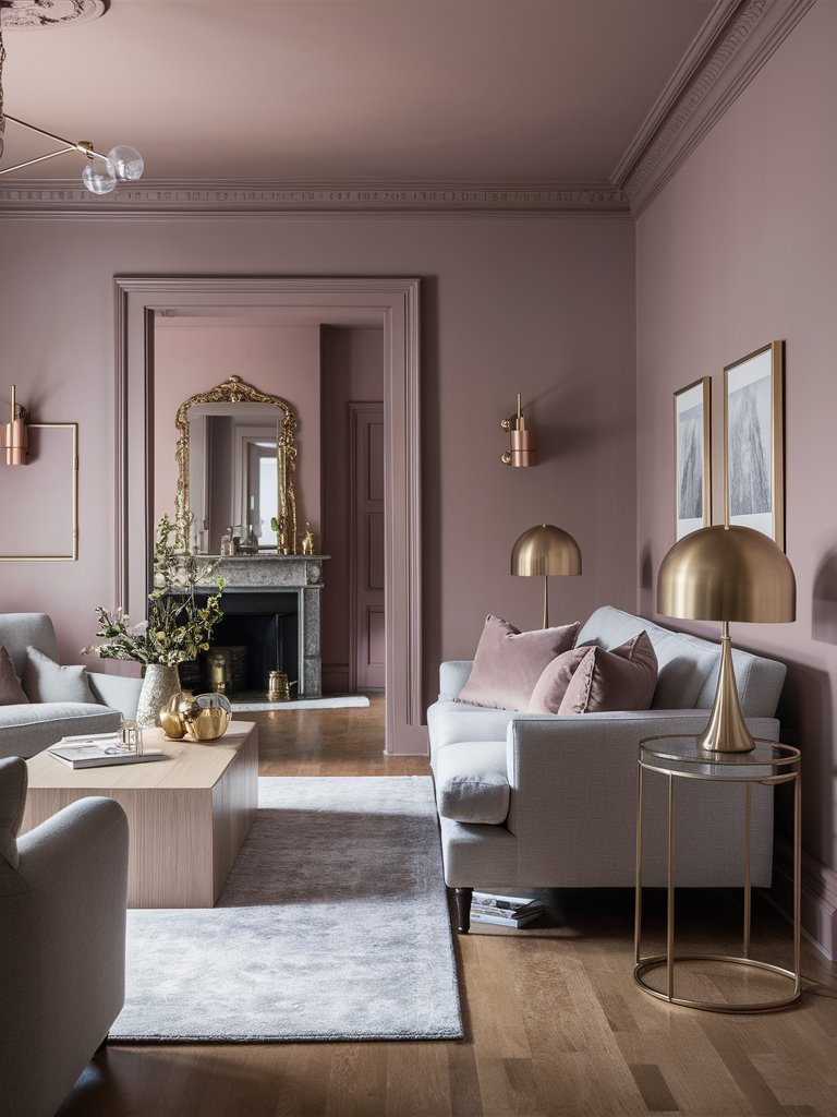
Sherwin Williams’ Rosé is a trendy dusty pink paint color with cool light purple undertones that could create a unique sense of serenity and refined elegance in your home space. It could fit really well in a social room like a living room to accommodate your loved ones in a beautiful environment over a cup of coffee.
Choose white sofas and armchairs to create a harmonious feel between the paint and furniture, making it even more soothing. Opt for a golden decoration focus – golden table lamps, side tables, sconces, and painting frames – to create a unique sense of charm and softness, nurturing your inner self.
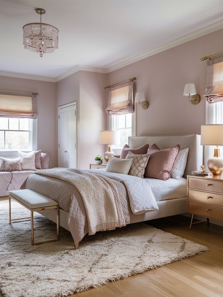
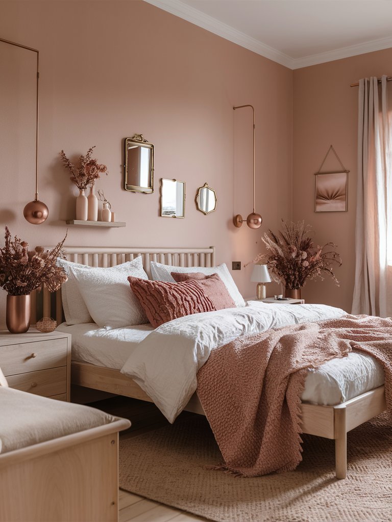
Sherwin Williams Charming Pink
Sherwin Williams’ Charming Pink is a cool, beguiling pink with soft peach undertones that could create a whimsical feel in your home space due to its paleness of color. This trendy paint could fit best in an intimate room, such as a bedroom, where it can grant you a soothing ambiance perfect for unwinding after a long, exhausting day.
Choose a big, pink bed frame and some pink decorative pillows and throw blankets to complement the paint in a stylish way. Opt for pale ash wood nightstands and drawers to capture the paint’ softness and add subtle golden or crystal elements for the chandelier and sconces to achieve an elegant look.
2. Benjamin Moore
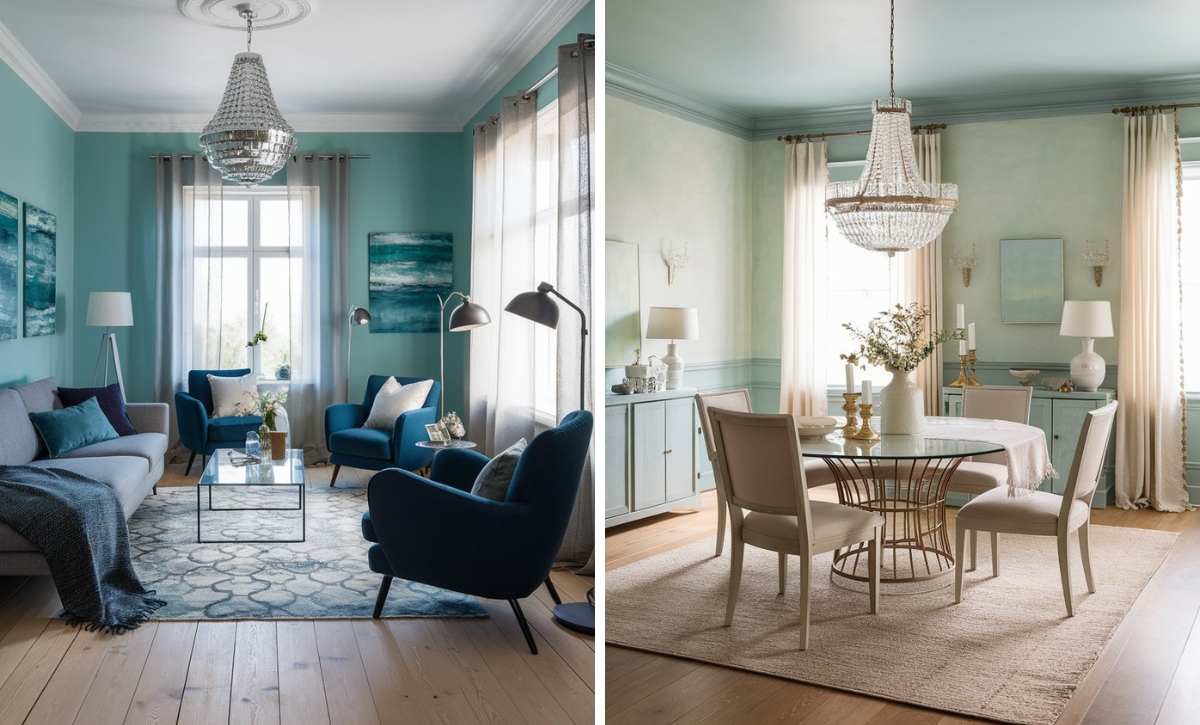
Benjamin Moore Arctic Blue
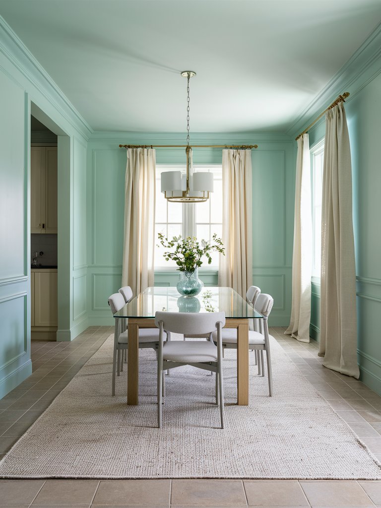
Benjamin Moore’s Arctic Blue is an eye-pleasing light blue touched with crisp green undertones that could create a refreshing ambiance in your home space with its cool shading. Its uniqueness and undoubtable charm makes it the perfect choice for a gathering room, such as a dining room.
You can integrate a wainscoting design for the walls for a more textured and elegant look. Keep the interior design simple by adding white chairs and carpets and a glass dining table to make the paint stand out. Make sure to always have a fresh bouquet on the table to enhance the dining room’s refreshing feel.
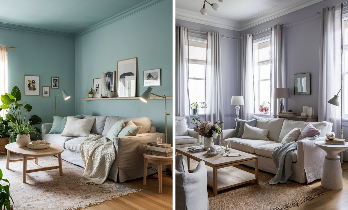
Benjamin Moore Calypso Blue
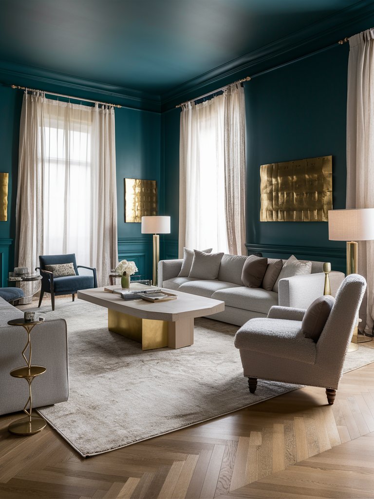
Benjamin Moore’s Calypso Blue is a rich, majestic teal with strong dark blue undertones that could infuse your home space with festive flair and sophisticated drama with its cool, deep tones. Therefore, it is the perfect fit for a social room, such as a living room, where you can give your guests a unique home experience.
Choose gray upholstered furniture with a single dark blue chair as an accent to the paint. Add a uniquely shaped coffee table to enhance the room’s visual appeal and choose focus on golden decoration elements like ornamented side tables, wall motifs, and lamp bases to create a sense of refined elegance in your living room.
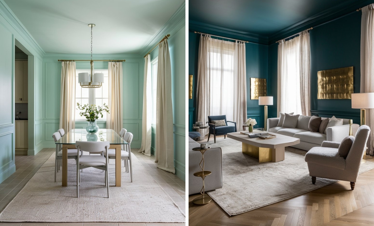
Benjamin Moore Ocean Air
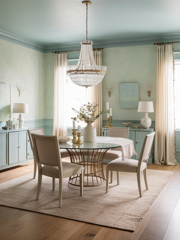
Benjamin Moore’s Ocean Air is a soft blue-green paint color with pastel tinges that could create an instant soothing sense in your home space with its tranquil shading. It could fit best in a social room, such as a spacious dining room with abundant natural light to show off the trendy paint’s best qualities.
Opt for integrating ornamented wainscoting and paint it in the serene Ocean Air color, together with the cornices and the drawers in the room to create a nice frame. Add a round glass dining table and beige chairs, carpets, and curtains to capture the soothing sense. Make sure to add ceramic and crystal decoration elements for an elegant finishing touch.
3. Behr
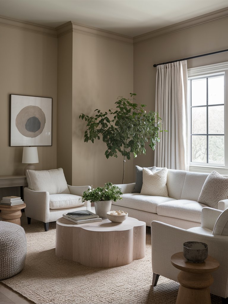
Behr Natural Gray
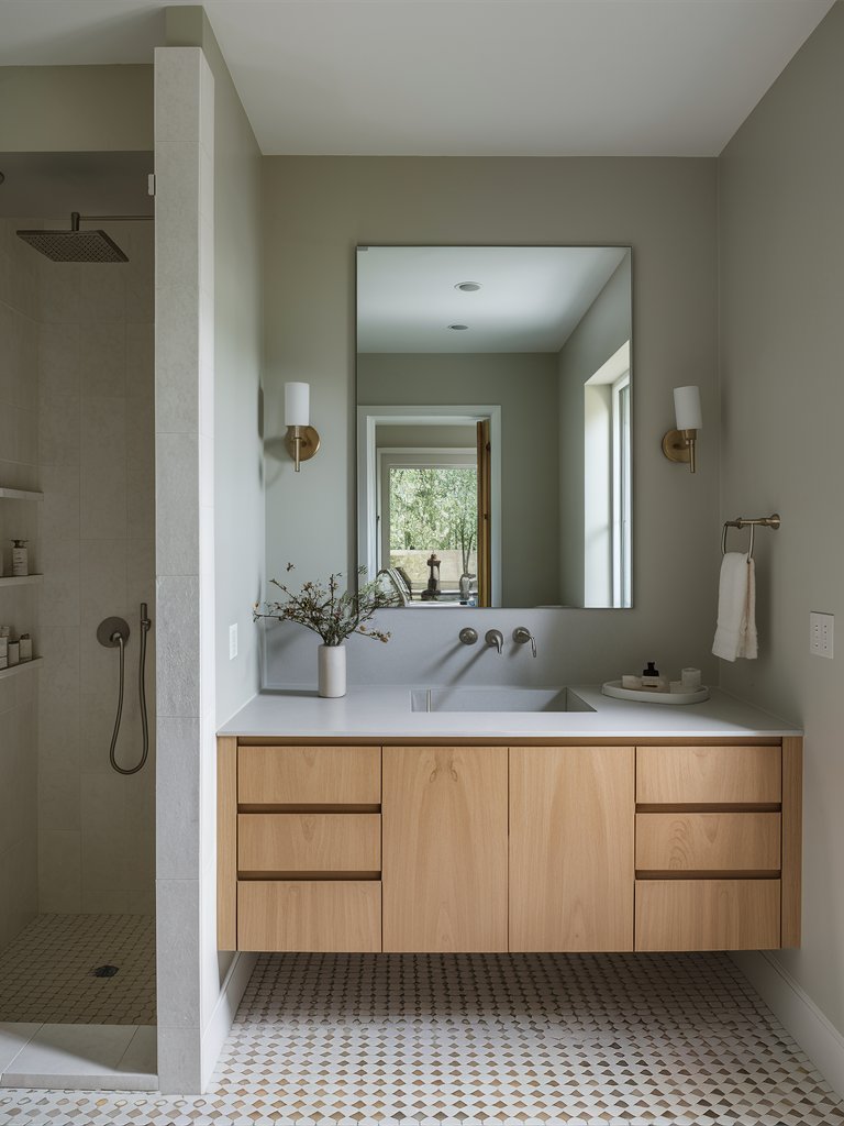
Behr’s Natural Gray is a neutral grey paint color with a hint of olive green that could give your home space a modern and sophisticated touch. It is also a color composition that inspires peace and serenity, making it the perfect choice for a bathroom, where you need all the relaxation you can get after a long day.
Choose a pale wood bathroom vanity with glazed white countertop for a sense of serenity and charming design. Opt for minimalistic ceramic decorations like a vase with faux flowers to enhance the bathroom’s visual appeal, and a tray for your cosmetics. Add golden sconces on each side of the mirror for a tinge of elegance.
Behr Silver Drop
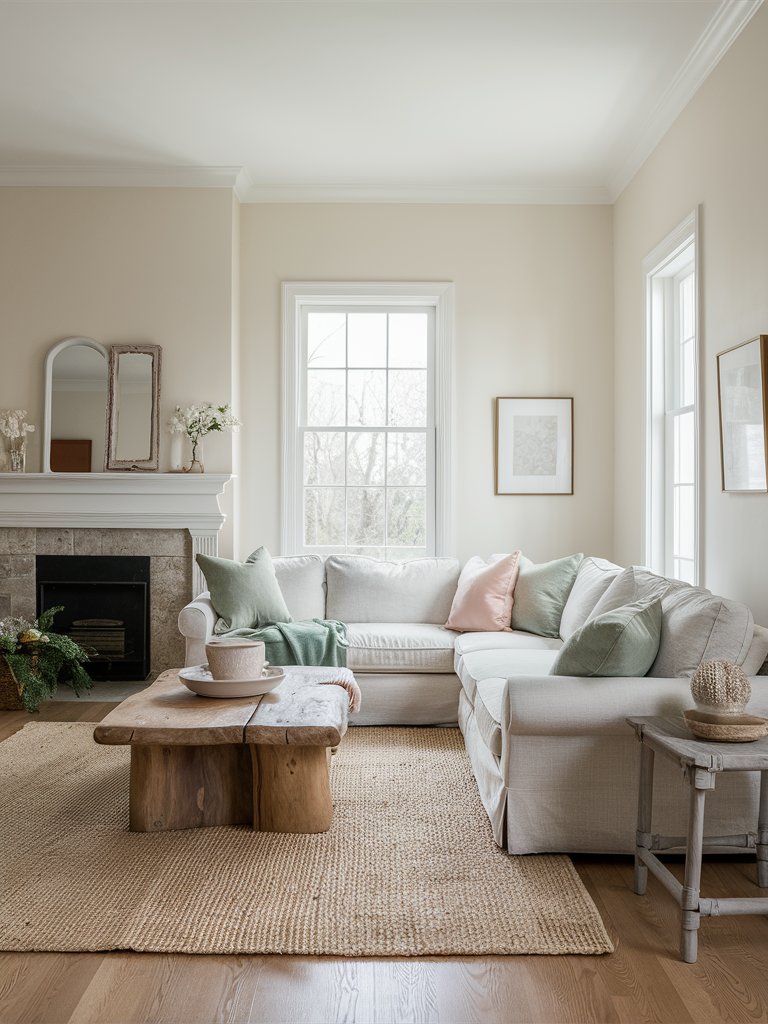
Behr’s Silver Drop is a warm beige paint color with strong white undertones that could create a sense of serenity and unique charm in your home space. It is a soft paint that looks creamy in a room with abundant natural light, making it the best fit for a social room, like a living room.
Choose a comfortable white sofa with pastel decorative pillows to capture the paint’s charm and softness. Opt for a raw wooden coffee table as a visual focal point for a natural, refreshing feel. Add wooden and ceramic decoration elements and rattan carpets to enhance the paint’s soothing effect.
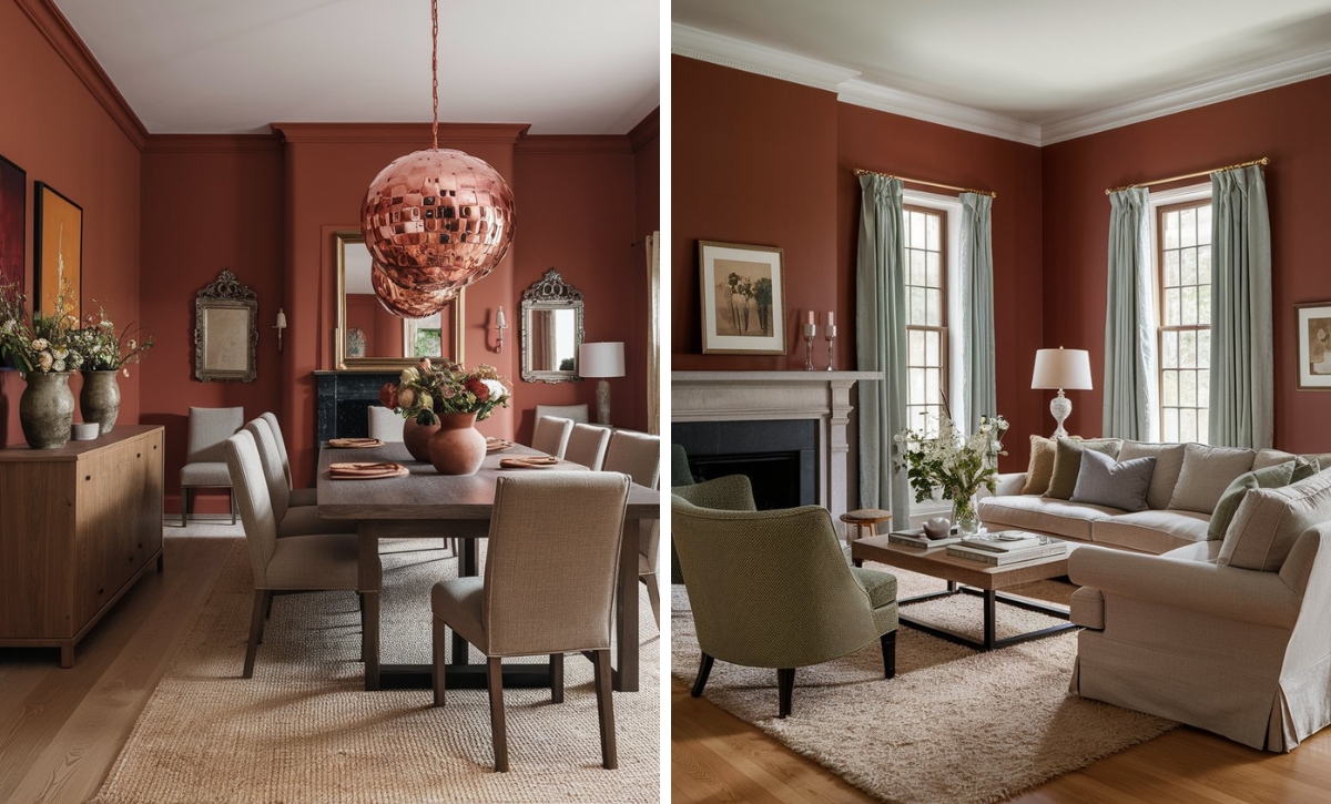
Behr Wheat Bread
Behr’s Wheat Bread is a warm beige paint color with soothing undertones that resembles a stone-baked loaf fresh from the hearth. Therefore, it could be the best choice for a social room, such as a living room, to create a homey and comfortable setting for your loved ones and yourself through its soothing qualities.
Opt for white upholstered furniture and soft white curtains for a unique soothing feel. Add rattan elements like carpets and round ottomans, together with wooden side tables for a natural, refreshing feel. You can also choose a uniquely shaped pale wood coffee table for a stylish feel and spread greenery around the living room as a nice finishing touch.
4. Farrow and Ball
Farrow and Ball Pink Ground
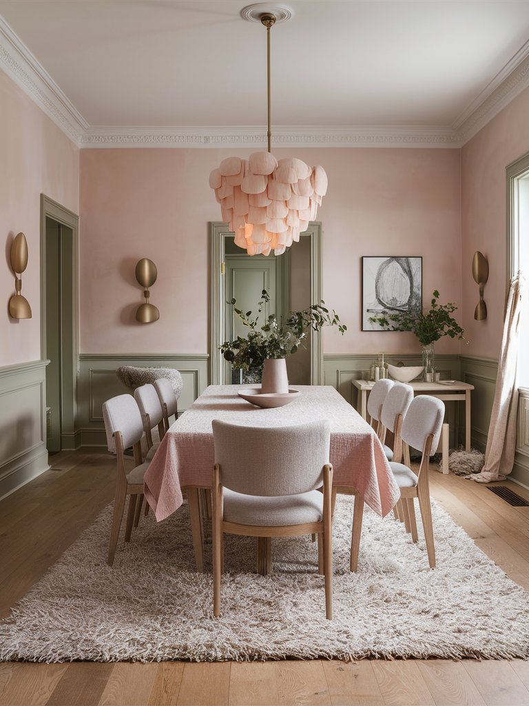
Farrow and Ball’s Pink Ground is a dusty blush pink paint color with creamy undertones that could create a sense of warmth and comfort in your home space with its delicate hues. Therefore, it could fit best in a gathering room, such as a dining room, where it can create an inviting space for your loved ones.
If you want to create a trendy look in your dining room, you can integrate wainscoting and paint it olive green to ensure a harmonious contrast with the pink paint. Choose soft, light-coloured furniture to complement the paint’s soothing effects and install a delicate petal-like chandelier in soft pink as an elegant centrepiece.
Farrow and Ball Calamine
Farrow and Ball’s Calamine is a delicate pink paint color with a touch of gray that could create a refreshing, soothing feel in your home space. It could be the perfect choice for a social room like a living room, where you can invite your guests in a soothing environment over a cup of coffee for a beautiful conversation.
Opt for white ornamented wainscoting to enhance the room’s visual appeal and elegance. Choose upholstered furniture in color combination of white, gray, and pink for variety and high style. Focus on golden and pink decoration elements like lamps, vases, and trays, for a unique charming feel.
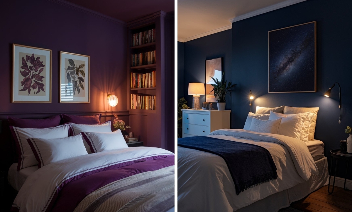
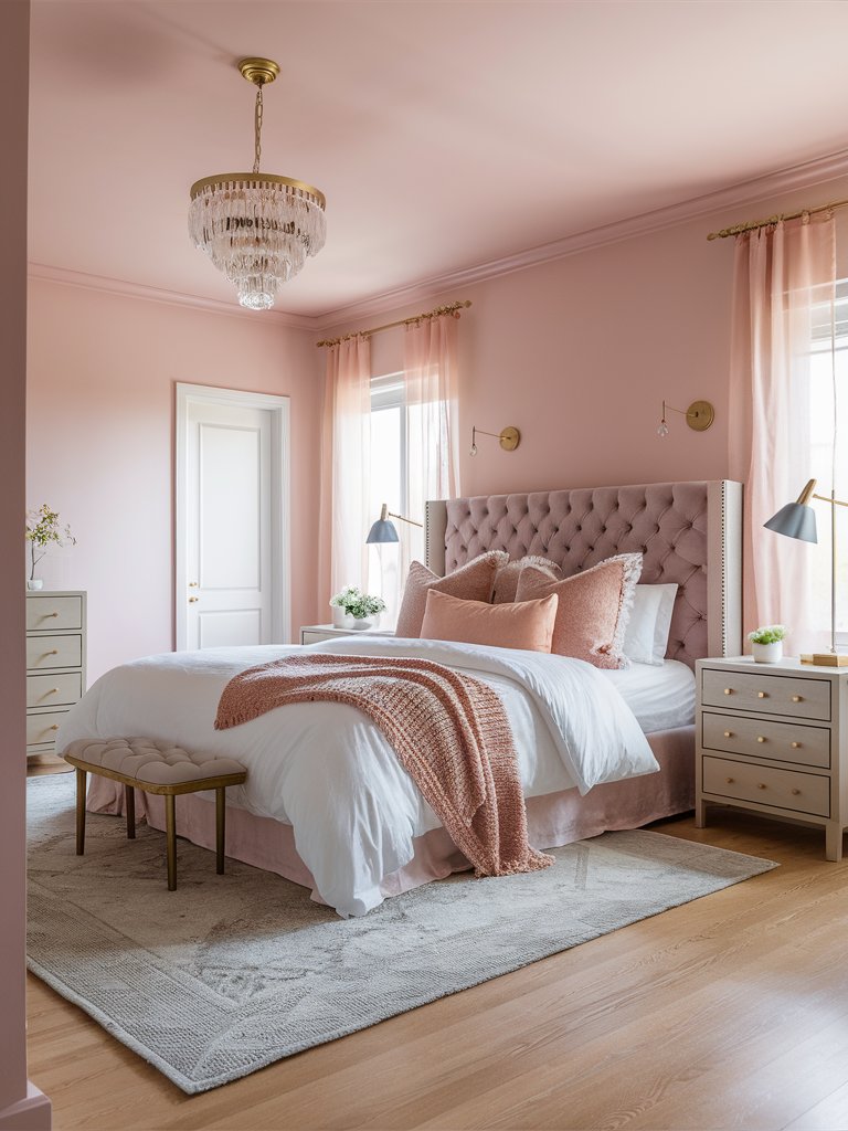
Farrow and Ball Cinder Rose
Farrow and Ball’s Cinder Rose is a wildly romantic rose pink with dusty undertones that could create a calming, soothing feel in your home space due to its beautiful hues, predisposing tranquility and unique charm. Therefore, it could fit really well in a more intimate room, such as a bedroom, where you can easily unwind and be embraced by its serene shades.
Opt for a simple pale wood furniture and bedding with dusty pink decorative pillows and throw blankets to complement the paint. Add copper vases and pendant lights with beautiful faux bouquets and hang some small gilded mirrors above the bed as a beautiful composition choice that could enhance your bedroom’s visual appeal.
What Color Compliments Trendy Colors?
- Warm White
- Matte Black
- Soft Gray
- Sage Green
- Blush Pink
Warm White
Warm white is a versatile and timeless color that pairs beautifully with trendy colors. It provides a clean, neutral base that allows trendy hues like deep teal, burnt orange, or pastel lavender to shine without overwhelming the space. This combination works well in modern and minimalistic designs.
Use warm white on walls or larger furniture pieces to create a bright, airy backdrop that enhances the trendy accents.
Matte Black
Matte black offers a bold and dramatic contrast to trendy colors, adding a sleek and modern edge. This pairing is ideal for contemporary spaces or urban interiors where you want to ground vibrant colors like mustard yellow, electric blue, or coral.
Incorporate matte black in light fixtures, furniture, or accent walls to create depth and contrast, highlighting the trendiness of bold hues.
Soft Gray
Soft gray provides a subtle, sophisticated base for trendy colors, allowing them to pop while maintaining a chic and understated look. This combination works especially well in Scandinavian or minimalist designs, where balance and simplicity are key.
Use soft gray in textiles, rugs, or paint to complement trendy tones like sage green, blush pink, or soft peach, creating a serene yet stylish vibe.
Sage Green
Sage green is both trendy and versatile, offering a natural, earthy complement to other popular colors like terracotta, millennial pink, or muted blues. It adds a calming, organic feel that grounds vibrant colors while keeping the palette fresh and modern.
Incorporate sage green through plants, accent décor, or paint to enhance the natural beauty of trendy colors, creating a balanced and cohesive space.
Blush Pink
Blush pink adds a soft and romantic contrast to trendy colors, making it perfect for pairing with bolder hues like navy blue, mustard yellow, or emerald green. This combination creates a playful yet elegant look, ideal for living rooms, bedrooms, or stylish home offices.
Use blush pink in throw pillows, artwork, or accent furniture to create a delicate contrast that complements trendier tones, keeping the space youthful and fresh.
Color Disclaimer
Please note that all paint colors displayed on this page are for illustrative purposes only. Due to variations in screen settings, lighting, and other factors, the colors you see on your screen may differ from the actual paint colors. We recommend viewing a physical color sample or swatch for the most accurate representation. Some images might be generated by AI to represent paint colors in different interiors