People are skeptical of decorating with red because it’s perceived as too bold. In fact, over the years, most interior spaces have been dominated by neutral hues that match most design styles. However, many designers have recently begun exploring and experimenting with bolder hues.
With trendy styles like maximalist and dopamine decor on the rise, many homeowners are embracing color trends that add drama and interest to a space. One unique shade of red you can use to achieve this effect is brick red.
Brick red is a sophisticated shade of red that adds dramatic interest to your space. It evokes strong emotions such as passion, love, and urgency and works well in spaces where you’re looking for heightened energy and stimulation, such as living rooms, dining rooms, or creative spaces.
Matching this color with the right accents is essential for a well-rounded look. Today, we’ve prepared some of the best brick red paint colors from Farrow and Ball and examples of how you can use them.
Take a look!
Farrow & Ball
Farrow & Ball Incarnadine
A shade deeply rooted in history, Farrow and Ball Incarnadine is a deep glossy brick red reminiscent of a shade that David Hicks used at Barons Court in the 1970s. It has a rich crimson tint that distinguishes it from other shades. While it may be considered a classic, this paint color will also work well in modern spaces.
Since it’s packed with different undertones, Incarnadine presents differently throughout the day. Morning light will bring out its subtle brown notes that add a ground quality while neutralizing its intensity.
Under warm afternoon light, the paint color exhibits its crimson quality, creating a warm, cozy feel. Under artificial light, it feels welcoming and comfy while still maintaining an airy quality.
Match it with earthy tones like Tanner’s Brown or natural elements such as woodwork. It also works exceptionally well when paired with bright white accents.
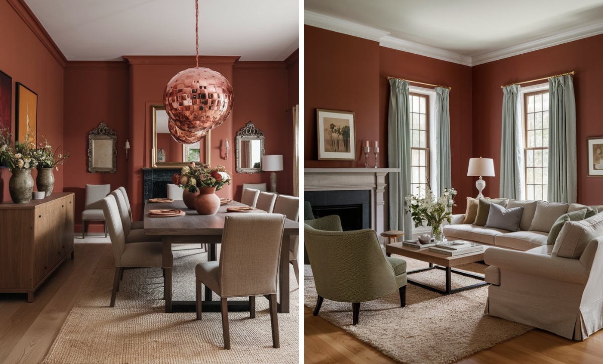
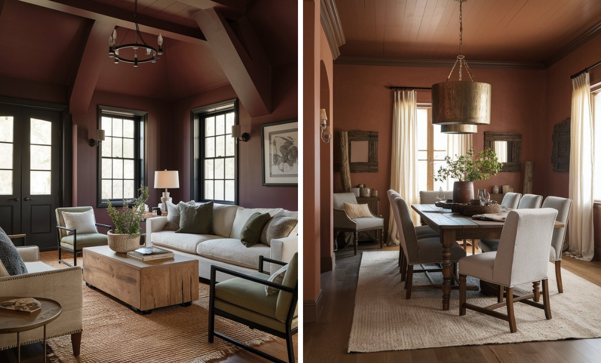
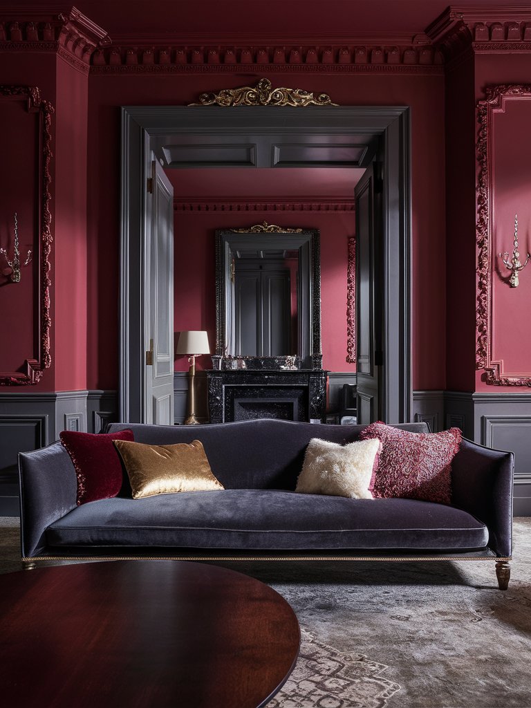
Incarnadine creates a warm, welcoming space in this living room, ideal for relaxing after a long day. Notice how the color combines well with darker shades, such as charcoal gray, to help ground the shade and reduce its intensity. Despite the bold tones, plenty of natural light maintains the space’s open, airy quality.
Farrow & Ball Rectory Red
Farrow and Ball Rectory Red is a paint color named after village houses built for the clergy over the years; as such, it packs centuries of English countryside sophistication. It’s a unique brick red in that it’s more “blackened and aged,” making it appear more sophisticated.
Rectory Red has complex brown undertones that add to its depth and character. The shade has a balanced RGB value that gives it unimaginable richness.
Under morning light, the blackened undertones become more prominent, adding to the warmth and coziness of the color. Warm light intensifies the red while adding a luxury feel.
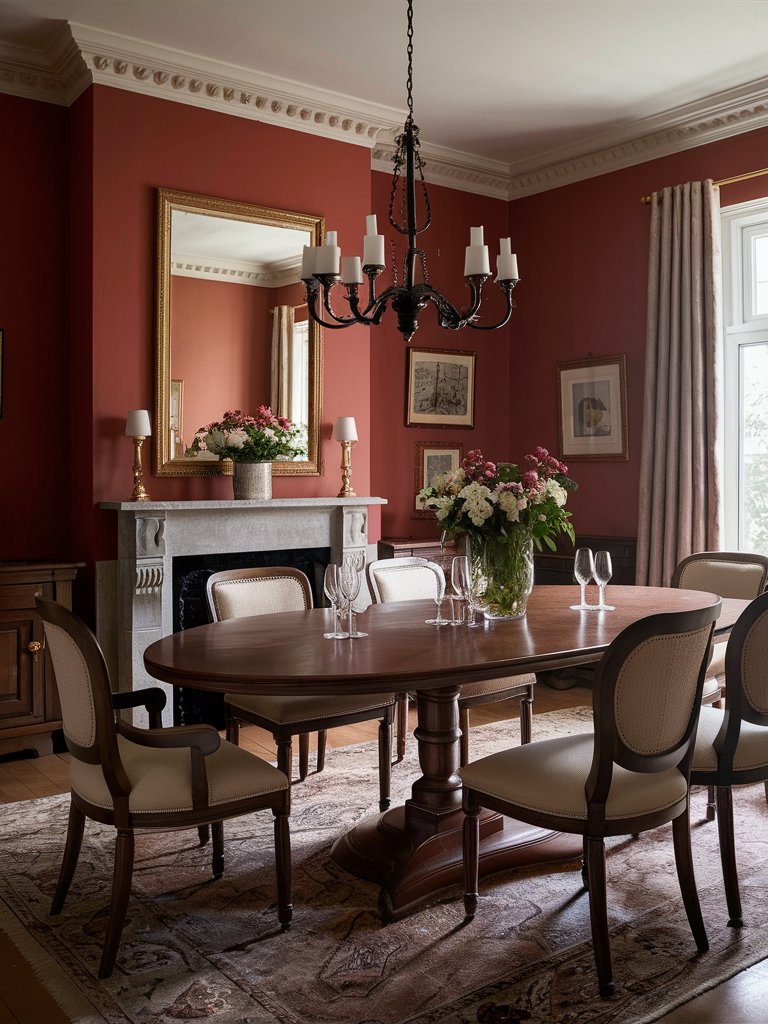
Even though it’s one of the boldest brick reds on this list, it works well in small rooms, making it ideal for spaces such as dining rooms. Match it with light tones like Joa’s White to create a luxurious feel.
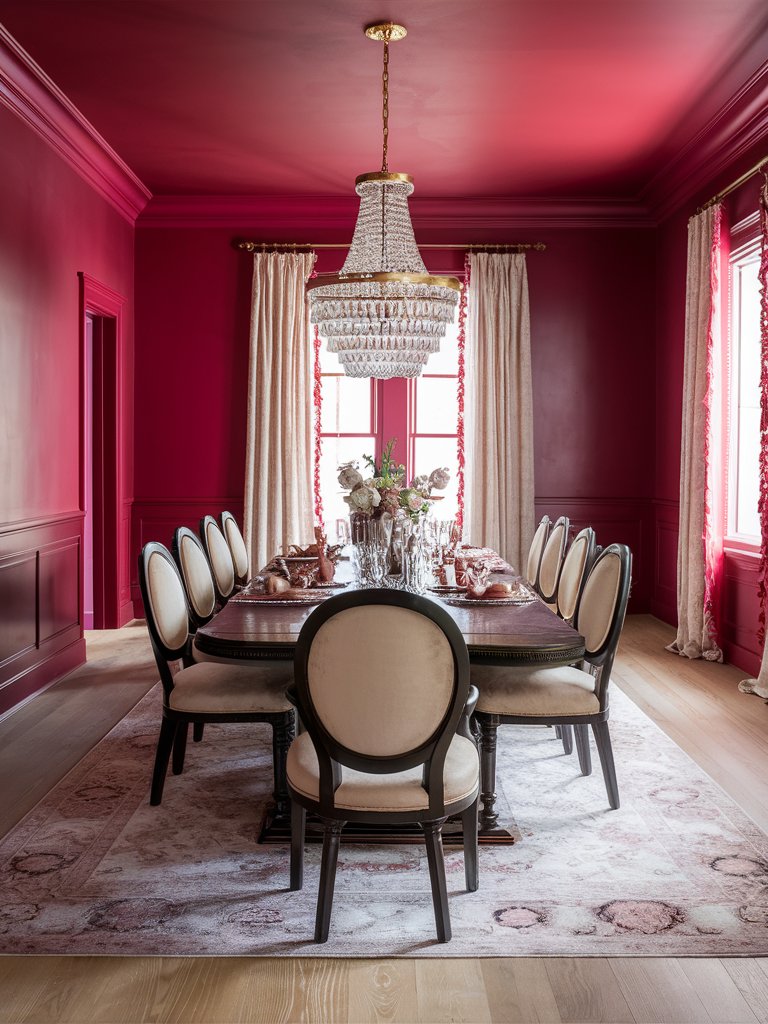
In this dining room, Rectory Red pairs with light tones like cream, creating a sense of balance while maintaining a good contrast and a sense of warmth. Plenty of natural light and glass accents help add an open, inviting atmosphere, while subtle metallic accents contribute to a royal look.
Farrow & Ball Blazer
If you’re interested in how this shade became known as Blazer, the name itself gives it away! A shade that mimics the attire of St John’s College in Cambridge, Farrow and Ball Blazer will infuse your space with the confidence of academics without the stuffiness associated with other brick red tones.
It’s a bright, cheerful red that reads like a more refined version of Rectory Red. It offers a warm feel without overwhelming the space.
Since it’s one of the attention-grabbing reds, it’ll work well in spaces where you want drama and intensity, such as dining rooms, living rooms, or conversation areas. Its confidence-boosting capabilities also make it an ideal choice for study rooms, libraries, or home offices.
Unlike other brick red tones, Blazer has subtle orange undertones that prevent it from looking too cold or harsh.
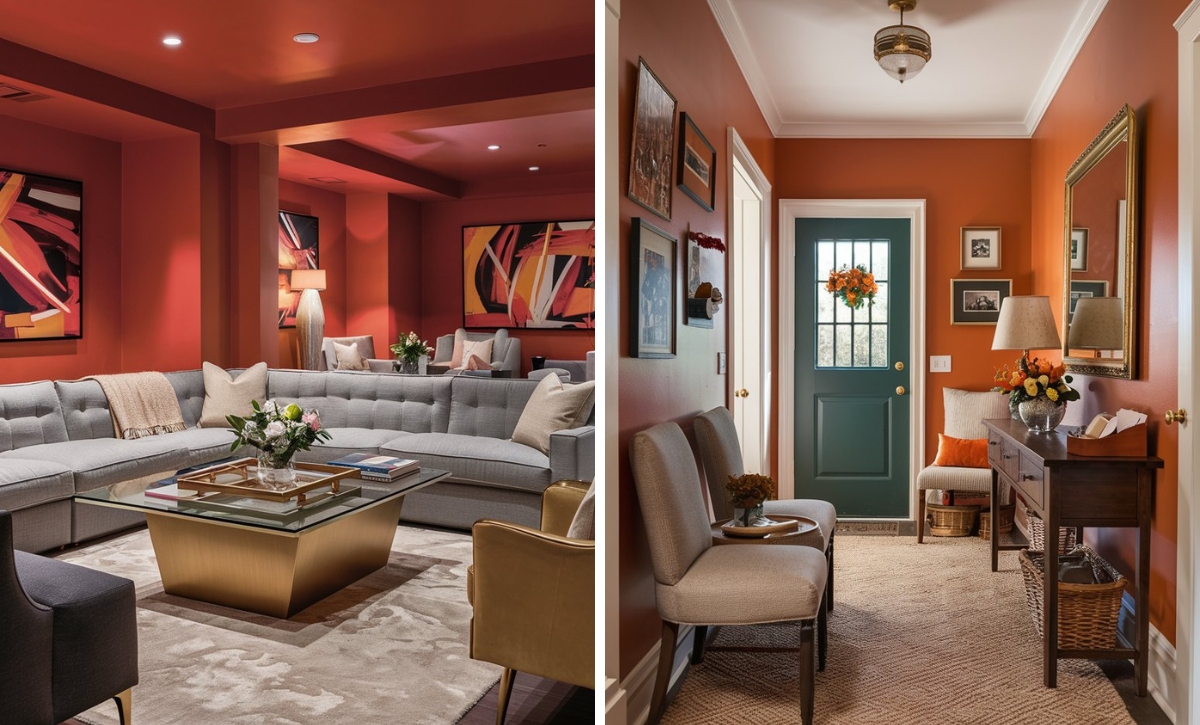
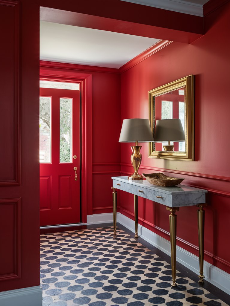
Notice how this shade combines with golden metallic accents in this entryway to create a royal-looking space reminiscent of a Victorian palace. The bright white shades help contrast the space, while the clean lines and minimalistic decor promote a clean, finished look.
Farrow & Ball Eating Room Red
A popular shade in dining areas, Farrow and Ball Eating Room Red is a brick red paint color befitting of its name. It gained prominence in the mid-19th century when it was used in most dining spaces, and you can instantly notice its nostalgic appeal.
It has a rich burgundy finish, an aged feel, and unprecedented complexity that other modern reds can’t match.
As suggested by the name and its historic use, Eating Room Red is ideal for spaces craving genuine gravitas. It’s a go-to shade for dining rooms and conversation sanctuaries, where it can make the space feel authentic rather than contrived.
It can also work well in home offices where it adds a confidence-inspiring presence. With an LRV of about 11, it’s one of the most absorbent reds, creating a three-dimensional depth feel.
True to its name, this shade creates an inviting feel in this dining room. With earthy undertones, the color matches well with the wooden finishes and other earthy tones in the area, such as gray. The light shades on the seats, curtains, and ceiling help create a balanced contrast.
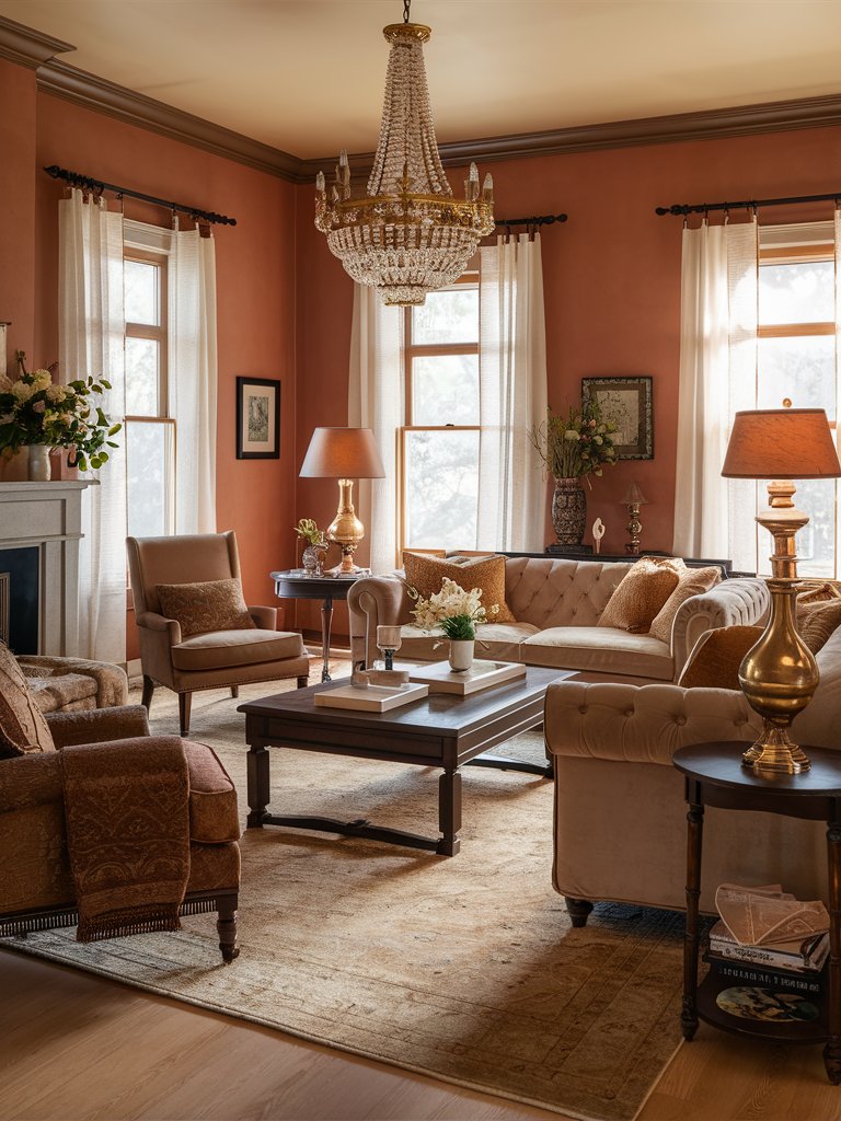
Farrow & Ball Red Earth
If you’ve visited places with red soil, then Farrow and Ball Red Earth should be nothing new. It’s a pigment that’s very much likened to fertile, rich soils.
Red Earth has a blend of red and yellow pigments. The shade has a warm terracotta look with subtle red undertones and is an ideal choice for those looking for a brick red shade that isn’t too intense.
Its unique look allows it to add a relaxed feel to any space, infusing a sense of warmth without overwhelming it. In fact, it’s one of the few reds that can add a cozy feel without needing many accents.
Under morning light, this shade will reveal its unique yellow undertones, which prevent it from feeling too heavy. Bright afternoon light, on the other hand, will bring out its earthy qualities. Its two-toned nature allows it to inspire different feelings throughout the day.
Notice how Red Earth creates a unique Mediterranean feel in this living room. The balance of earthy and bright neutral shades helps create a well-balanced space with no stark contrasts. To complete the cozy ambiance, several shiny metallic accents help reflect light while adding a classy feel.
Farrow & Ball Radicchio
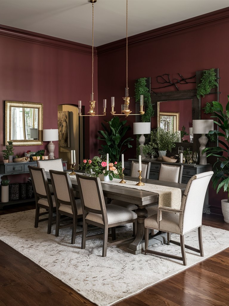
A bright and modern take on brick red, Farrow and Ball Radicchio balances British paint mastery with Italian culinary inspiration. Its name is inspired by the leaves of Italian Chicory, creating a unique sense of Mediterranean sophistication.
It’s a recent brick red shade inspiration with a distinct magenta undertone that adds to its contemporary feel.
Radicchio is a good paint choice for those craving boldness and refinement. The magenta undertones become more prominent in natural light, maintaining a vibrant energy while preventing any harshness.
Since it also contains touches of blue pigment, it brings a strong yet contemporary feel to a space. Use it in spaces where you want to infuse the room with energy or in conversation areas.
Radicchio has been used to create a contemporary feel in this dining room. The wooden finishes and light neutral tones help create a sense of balance and contrast, while plenty of plants evoke a grounding quality. The mirrors not only help reflect light, but their metallic design also adds a unique element.

Color Disclaimer
Please note that all paint colors displayed on this page are for illustrative purposes only. Due to variations in screen settings, lighting, and other factors, the colors you see on your screen may differ from the actual paint colors. We recommend viewing a physical color sample or swatch for the most accurate representation. Some images might be generated by AI to represent paint colors in different interiors