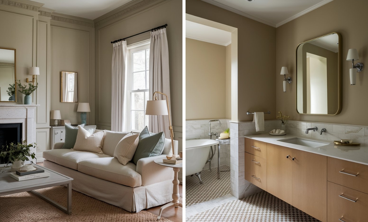
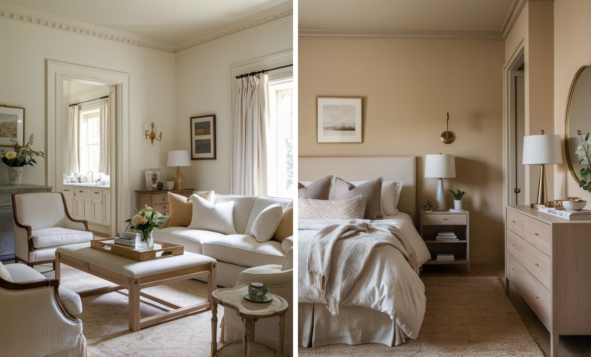
Pastel paint colors could create a soft and welcoming ambiance in your home space, making it feel larger and brighter with the serene, creamy appearance of the paint. The light and airy qualities of pastel paints could invite a sense of serenity and high charm into your home space, enhancing its visual appeal.
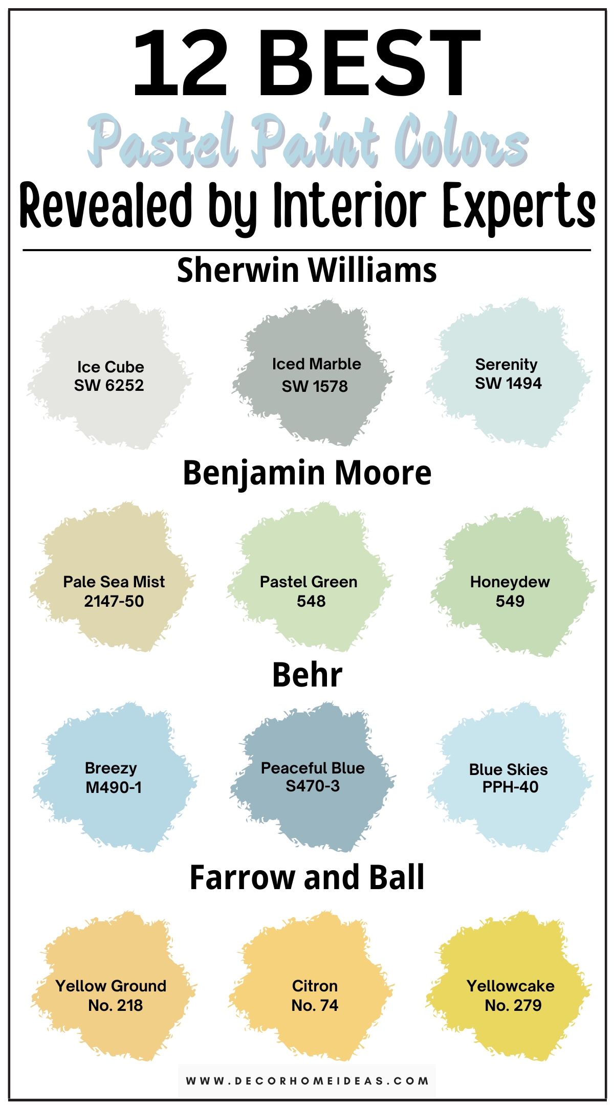
We have selected twelve of the best pastel paint colors, including blue for a calm and restful energy, green for a refreshing, earthy charm, and yellow for an uplifting, sunny feel. Whether you are looking for the perfect paint for your makeover or just want to draw some inspiration for future interior plans, this article has everything you need.
1. Sherwin-Williams
Sherwin-Williams Ice Cube
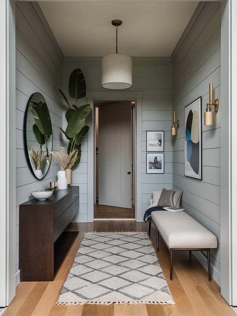
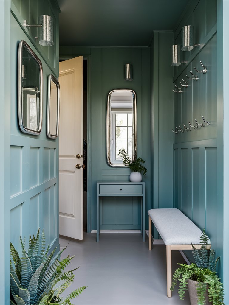
Sherwin-Williams’ Ice Cube is a pale white-gray paint color with pastel undertones that could create a cool, stylish ambiance in your home space, especially in a room with less natural light, enhancing it with inner brightness and serenity. You can use this paint in an entryway for an elegant first glance into your sacred home space.
Opt for a mahogany console table as a contrasting point to the paint’s coolness. Choose a beige entryway bench and carpet to complement the color and add some golden and ceramic decoration elements to enhance its elegance. You can also add a tall plant in the room’s corner for a refreshing, natural feel and a cozy finishing touch.
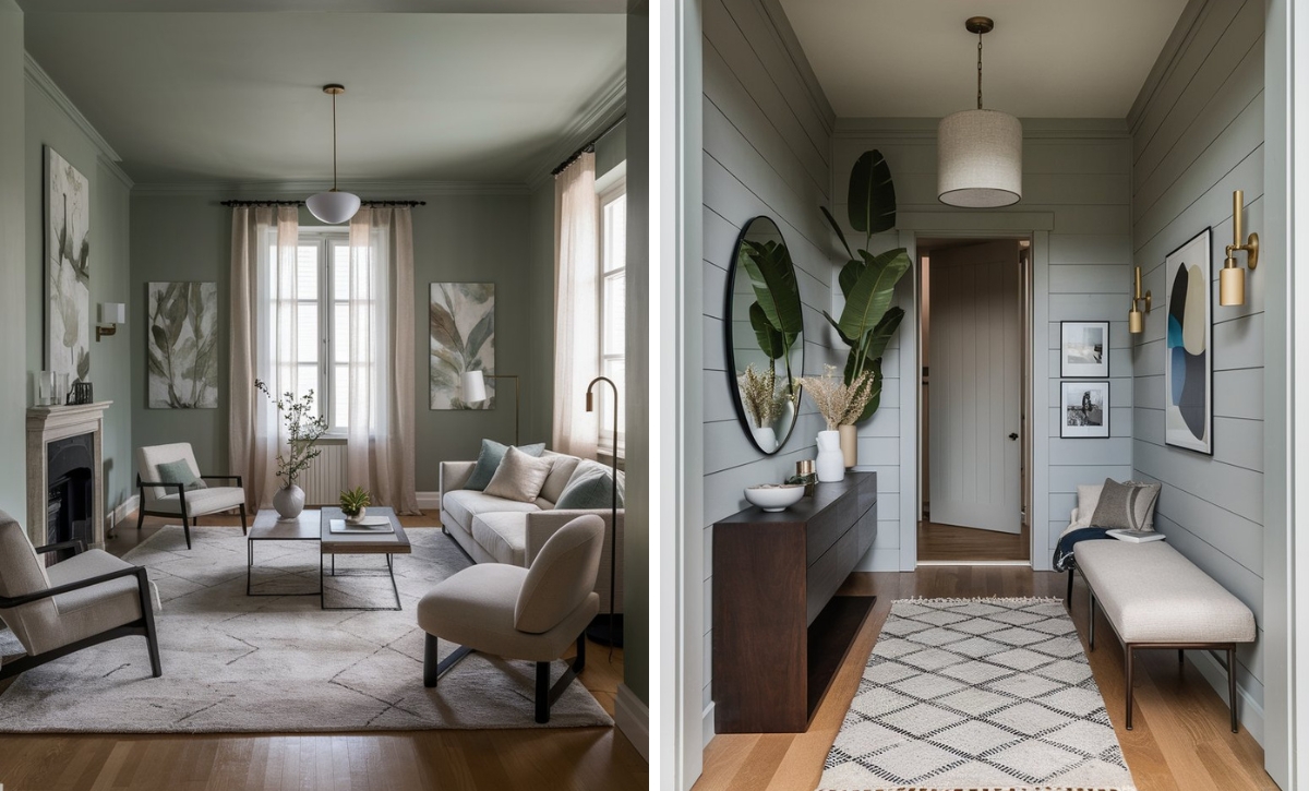
Sherwin-Williams Iced Marble
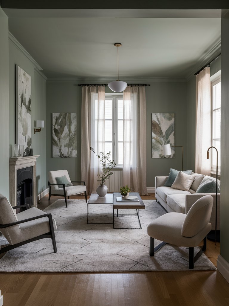
Sherwin-Williams’ Iced Marble is an earthy green paint color with pastel silver undertones that could create a refreshing sense of cool charm and refined elegance. It could be the perfect fit for a gathering room, like a living room, where it can invite an effortless, stylish feel that will impress your guests.
Opt for white and beige upholstered furniture to create a soothing blend with the green paint. Choose accent pale green elements, such as decorative pillows and pastel paintings. You can also spread greenery around the living room for a natural, refreshing feel, together with subtle glass and ceramic elements for a sense of refined elegance.
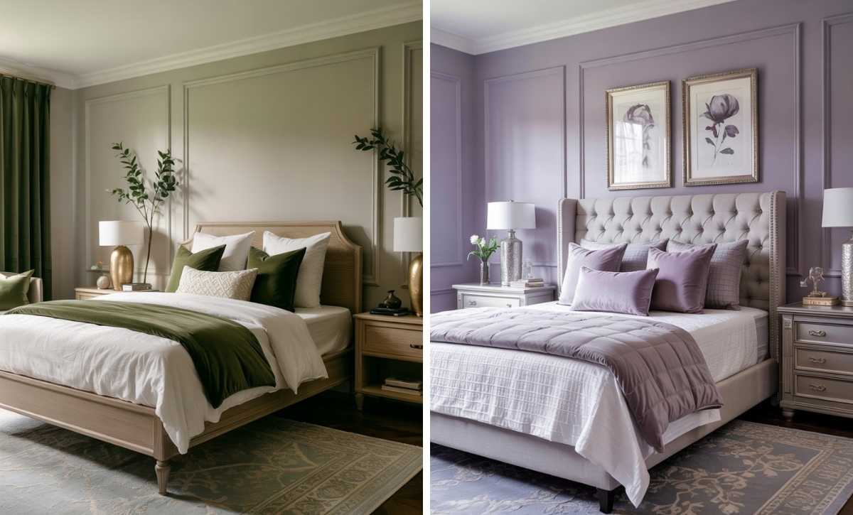
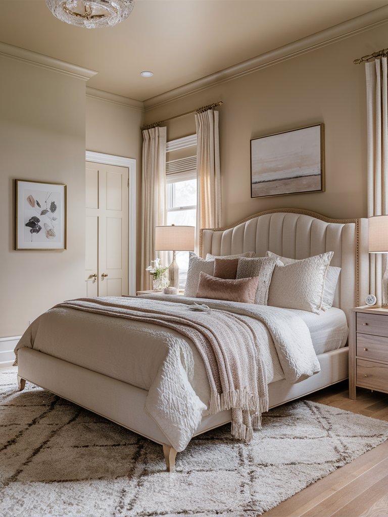
Sherwin-Williams Serenely
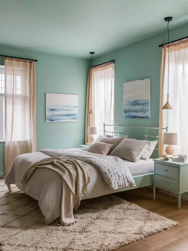
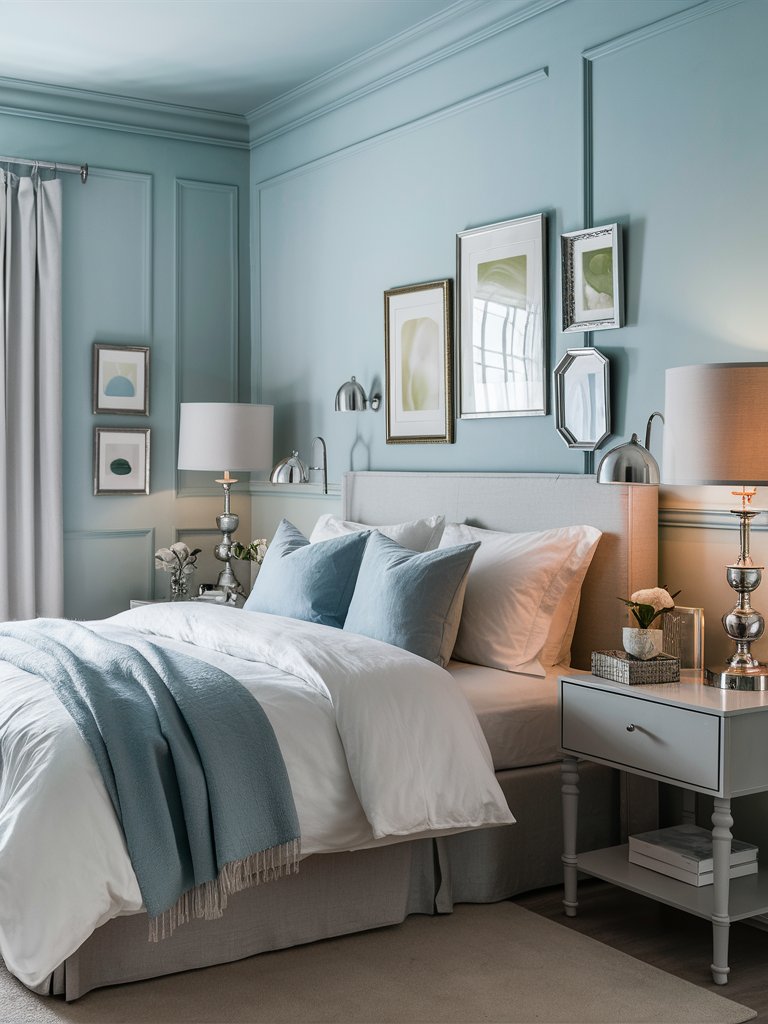
Sherwin-Williams’ Serenely is an eye-pleasing pastel green paint color with mint blue undertones that emits a unique kind of cheerfulness, mixed with serenity and a soothing effect. It could be best integrated into more intimate rooms, like a bedroom, where it can grant you the needed softness and relaxation you need after a long day.
It is an ingenious idea to paint your bed frame and the nightstands in the same paint to create a continuity in design through a nice framing effect. Match the pastel green paint with warm beige bedding, curtains, and decoration elements to create a contrasting design in the bedroom by juxtaposing warmth and coolness for a unique and stylish effect.
2. Benjamin Moore
Benjamin Moore Pale Sea Mist
Benjamin Moore’s Pale Sea Mist is a soft beige paint color with yellow-green undertones that could invite a soothing, elegant feel into your home space. It is a color that could effortlessly make you feel relaxed, making it the perfect choice for a more intimate room, such as a bedroom, to support your well-being.
Opt for soft furniture and light-colored elements to invite a unique sense of softness and charm into your bedroom. Choose beige bedding and curtains, together with pale wood nightstands and drawers. Add subtle golden decoration elements and ceramic or glass vases to enhance the room’s visual appeal and charm.
Benjamin Moore Pastel Green
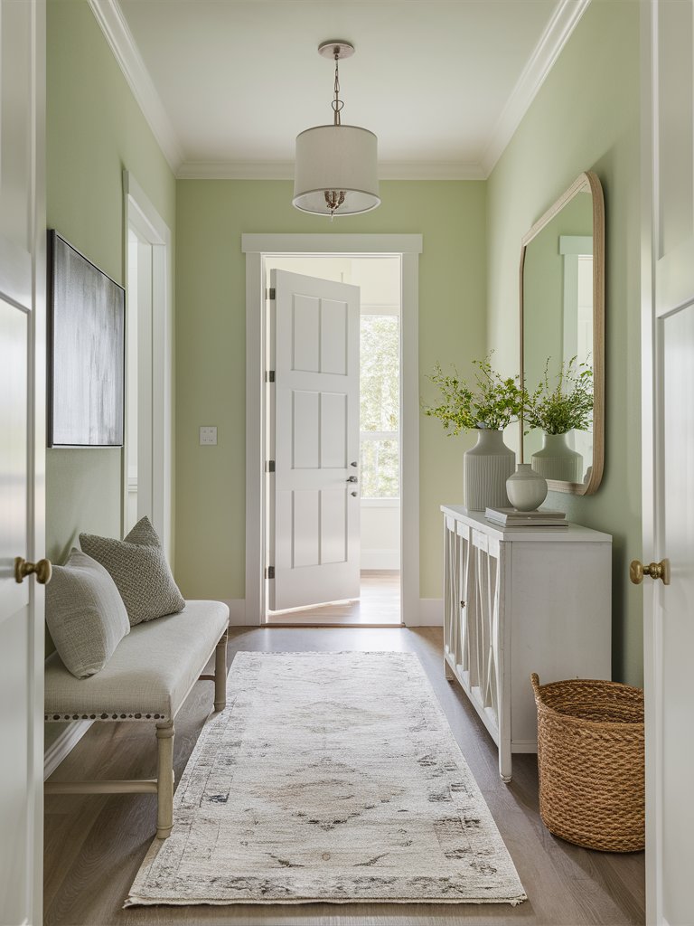
Benjamin Moore’s Pastel Green is a beautiful spearmint green paint color with pastel tinges that could instantly awaken your home space with its cheerfulness and dreamy appearance. It would fit best in an entryway to greet your guests with its whimsical, soft qualities for unique charm and elegance.
Opt for an ornamented white console table as a soothing focal point in your entryway, together with a beige entryway bench to complement the paint’s softness. Focus on rattan decoration elements like storage boxes to create a refreshing, natural feel and add ceramic and wooden elements for a sense of refined elegance.
Benjamin Moore Honeydew
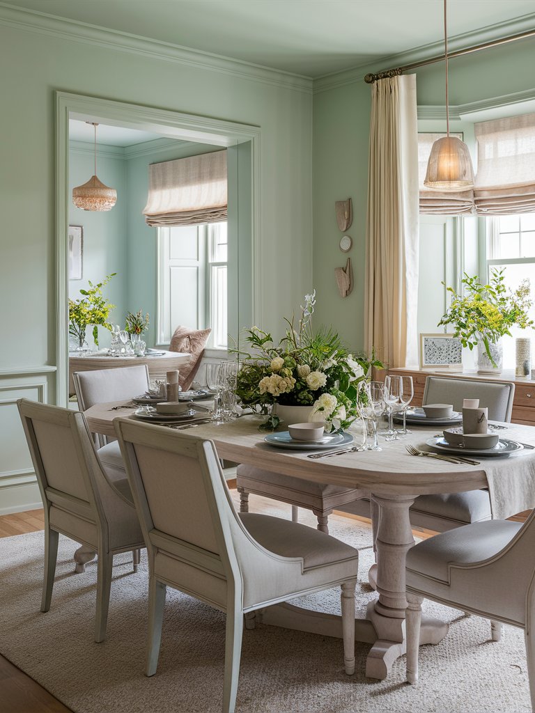
Benjamin Moore’s Honeydew is a pale green paint color with pastel undertones that could create a sweet, whimsical ambiance in your home space with its soft appearance and effortless charm. It could be the perfect fit for a gathering room, like a dining room, where you can have nice conversations with your guests over a delicious meal.
If you want to add more texture to the room, you can add wainscoting and paint it in the same soft paint. Opt for gray or white furniture and an ash wood dining table to capture the paint’s unique soothing effect. Spread greenery and fresh bouquets around the room for a whimsical, refreshing feel and enjoy your dining room’s irresistible charm.
3. Behr
Behr Breezy Blue
Behr’s Breezy Blue is a playful pastel paint color with light blue undertones that resembles a sunny sky after the rain, perfect for creating a gentle and relaxed surrounding in your home space. It could be best integrated into a social room, like a dining room, to create a beautiful ambiance for your meals.
Opt for pale wood furniture to best capture the paint’s soothing effect and create unique softness in your dining room. Choose stone and ceramic vases in various sizes and shapes to invite a sense of refined elegance and high style in your home space and spread some greenery around for a refreshing, natural feel.
Behr Peaceful Blue
Behr’s Peaceful Blue is a beautiful pastel blue paint color with slight gray undertones that could create a carefree, cheerful ambiance in your home space with its soft beauty. Its shade changes depending on the amount of natural light it gets, making it the perfect choice for an entryway for a harmonious, inviting feel.
If you want to create a more textured and stylish feel in your entryway, you can integrate overlay wainscoting. Furthermore, you can add some houseplants for a refreshing, inviting feel in your home. Opt for silver decoration elements like hangers, mirrors, and sconces for a sense of subtle beauty.
Behr Lovely Blue Sky
Behr’s Lovely Blue Sky is a unique pale blue paint color with pastel cool undertones that is reminiscent of warm summer days in the park, tracing the clouds in the blue sky in the same shade as this paint. It is a dreamy pastel color that could suit a more intimate room, like a bedroom, best due to its whimsical, soothing qualities.
Opt for gray bedding and furniture with light blue decorative pillows and throw blankets as an accent to the paint. If you are an artistic person, you can create a stylish gallery wall above the bed with ornamented frames. Focus on silver decoration elements like sconces, lamp bases, and trays as an elegant finishing touch.
4. Farrow and Ball
Farrow and Ball Yellow Ground
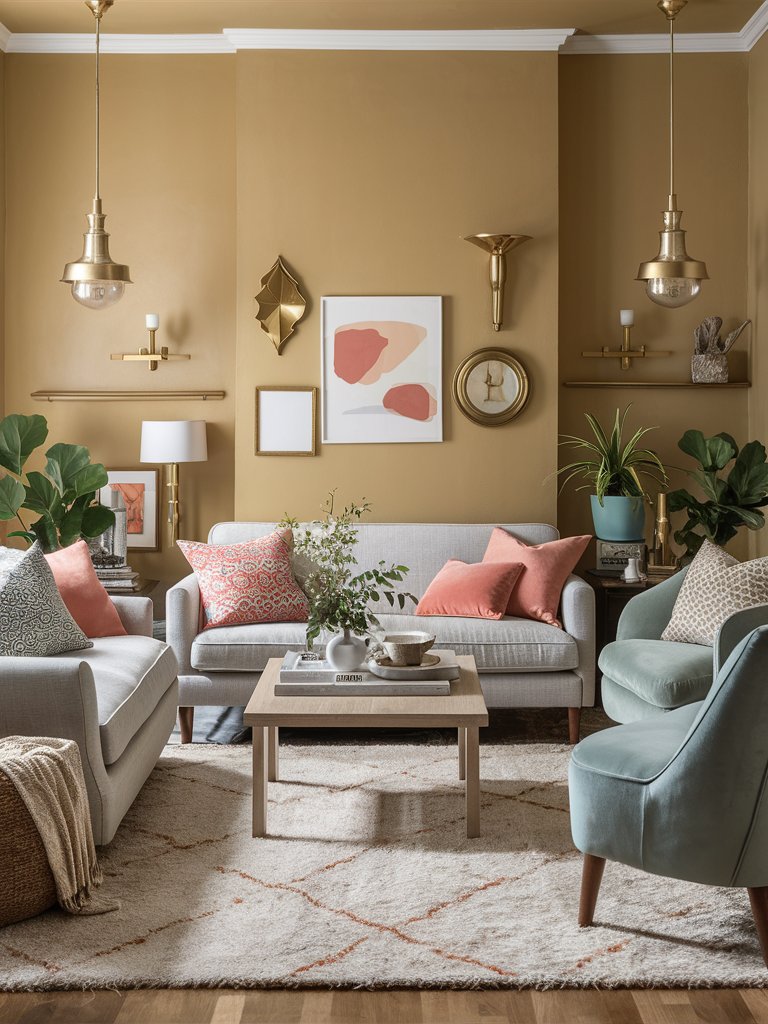
Farrow and Ball’s Yellow Ground is a pastel yellow paint color with golden undertones that could create a joyous and stimulating ambiance in your home space with its cheerful hue. It could be the perfect choice for a social room, like a living room, where you can enjoy the beautiful atmosphere it creates with your guests.
Opt for gray upholstered furniture to stand against the sunny paint and add accent pink elements, such as decorative pillows and paintings, as a contrasting point. Such enigmatic and dreamy hues of yellow could go extremely well with golden decoration elements like sconces, pendant lights, wall motifs, and frames.
Farrow and Ball Citron
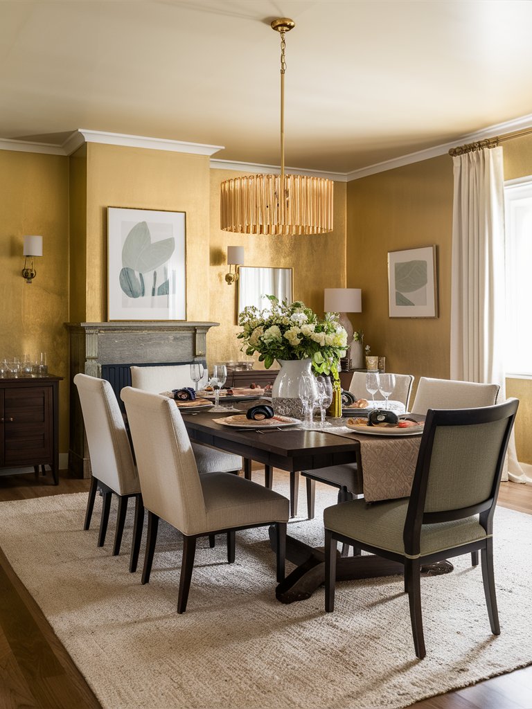
Farrow and Ball’s Citron is a warm lemon yellow paint color with pastel golden undertones that could create a cheerful, energizing ambiance with its bright intensity of color. It could suit a formal dining room well, enhancing its charm and inviting a sense of refined elegance.
Opt for a mahogany dining table, drawers, and fireplace to capture the paint’s intensity and elegant feel. Add beige curtains, carpets, and chairs to soothe the room’s visual appeal, and focus on golden decoration elements to complement the paint’s undertones and create a charming feel in the room.
Farrow and Ball Yellowcake
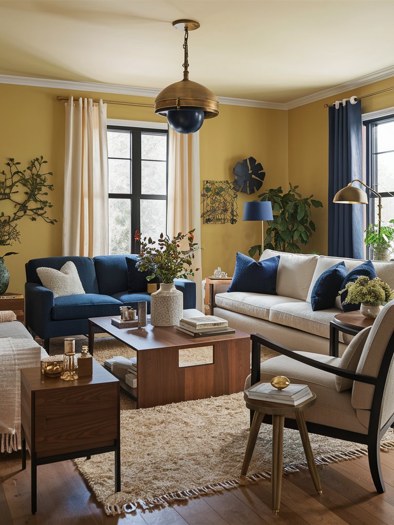
Farrow and Ball’s Yellowcake is a vibrant yellow paint color with pastel tinges that could create a homely feel with its energizing qualities that bring joy and refreshing emotions. It could be the perfect choice for a more social room, such as a living room, where you can share this joyous experience with your loved ones.
If you want to create a stylish look for your living room with this paint color, you can rely on adding a dark blue accent sofa and decoration elements like curtains, decorative pillows, and wall motifs. Moreover, focus on golden elements to invite a sense of refined elegance and spread greenery around the room for a refreshing feel.
What Color Compliments Pastel Colors?
- Soft Gray
- Warm White
- Gold
- Navy Blue
- Sage Green
Soft Gray
Soft gray adds a subtle and sophisticated contrast to pastel colors, enhancing their softness without overpowering them. This combination is ideal for creating a calm and balanced atmosphere, making it perfect for living rooms, bedrooms, or offices.
Incorporate soft gray in furniture, accent walls, or textiles to complement pastel shades like mint green, blush pink, or lavender while keeping the space modern and serene.
Warm White
Warm white provides a clean and crisp contrast to pastel colors, brightening the space while allowing the gentle hues to stand out. This pairing is perfect for kitchens, bathrooms, or nurseries where a fresh, airy feel is desired.
Use warm white in trim, cabinetry, or walls to create a light and open feel that enhances the delicate tones of pastel colors.
Gold
Gold adds a touch of elegance and warmth to pastel colors, creating a luxurious and glamorous contrast. This combination works beautifully in formal dining rooms, bedrooms, or living spaces where you want to evoke a sense of sophistication.
Incorporate gold in light fixtures, mirrors, or decorative accents to bring a rich, warm glow that complements pastel shades.
Navy Blue
Navy blue offers a bold and striking contrast to pastel colors, adding depth and richness. This pairing is great for creating a modern, balanced look in spaces like living rooms or bedrooms where you want to add a touch of drama while maintaining a soft overall aesthetic.
Use navy blue in furniture, accent walls, or rugs to create a dynamic contrast that complements the light, airy tones of pastels.
Sage Green
Sage green provides a natural, earthy contrast to pastel colors, adding a refreshing and organic feel. This combination is perfect for spaces like bedrooms, living rooms, or offices where you want to create a tranquil, nature-inspired environment.
Incorporate sage green in plants, accent décor, or textiles to add a calming, harmonious element to pastel palettes like soft pinks, blues, and yellows.
Color Disclaimer
Please note that all paint colors displayed on this page are for illustrative purposes only. Due to variations in screen settings, lighting, and other factors, the colors you see on your screen may differ from the actual paint colors. We recommend viewing a physical color sample or swatch for the most accurate representation. Some images might be generated by AI to represent paint colors in different interiors