We are about to change your perception of darker hues and make you see their charm as more than a seasonal trend.
Darker paint colors give depth and create a more classical look. These shades are often associated with the cooler months like the winter but now they are becoming a favorite for making a bold and dark statement.
Dark paints are a comeback, replacing the beloved grays and whites. These dark hues are not only a choice of paint color for your walls but for kitchen cabinets too.
The use of moody shades is a perfect choice of paint color for smaller spaces. It is no longer brave to use dark blues, grays, blacks and greens, instead, it’s the new color trends showing character. To grasp this new look and have the courage to go ahead and be bold and dark, we follow our designers’ top choices.
The Best Of The Dark According To Designers
Choosing harsh and overly gothic colors is not the look we are going for! So how do you make that dramatic designer pick? It’s not as hard as expected.
There are warmer, cozier and comforting shades to create that deep and dark design. Give your color choice a swatch! You have to choose your dark paint with some precision, so paint a large section you have chosen in the room and let it sit to see if it’s the shade you want to go for.
Testing it in place is essential so you can see if it sits right in your home with your lighting.
Diving in with deep gray, greens, blues and purples are the new trendy colors at the moment, here is our designer favorite palette.
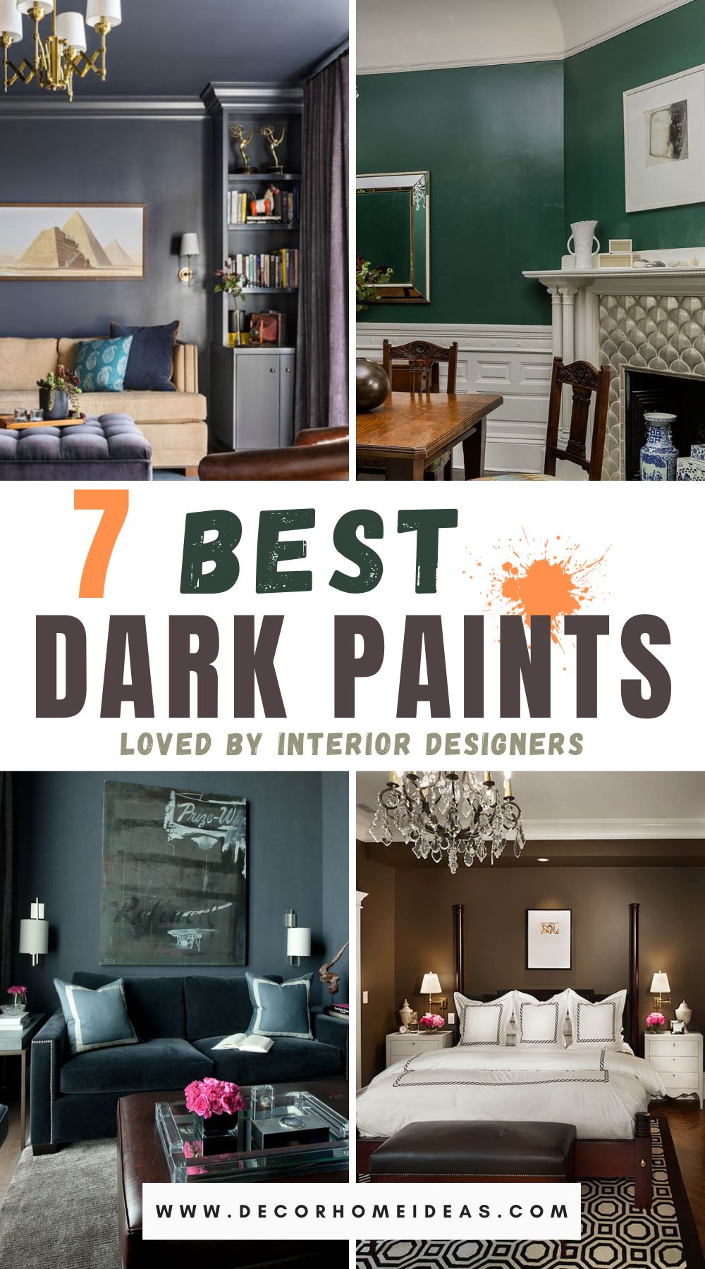
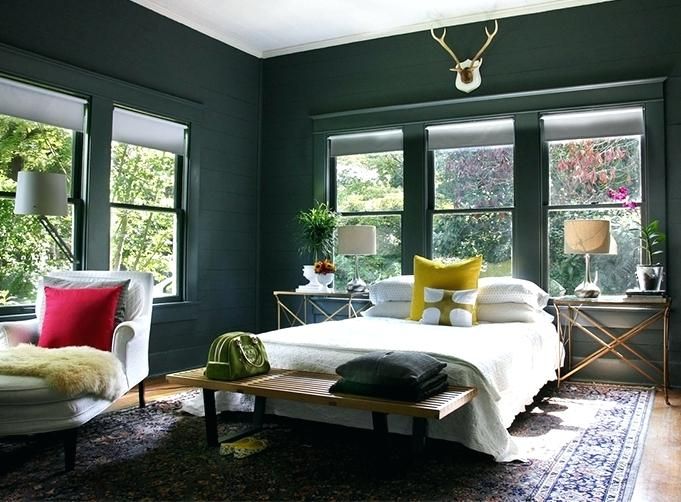
1. FARROW & BALL WITH RAILINGS
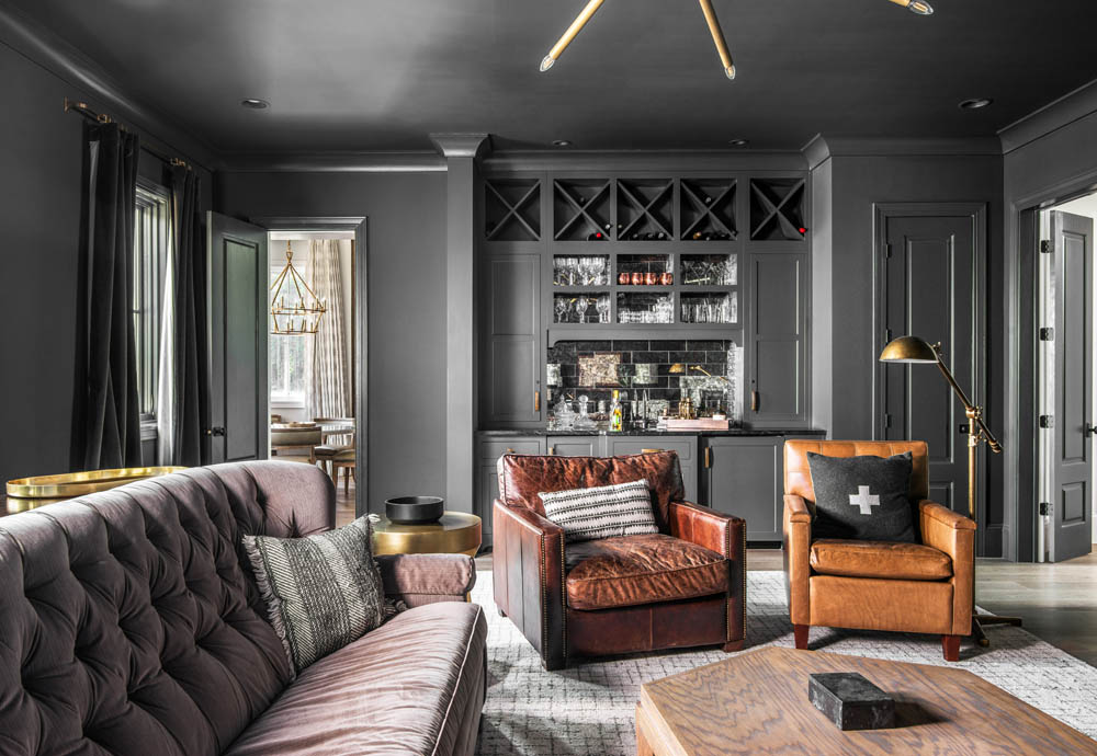
In a small and naturally poorly lit room going with dark walls can surprise you and diminish the drama of the dark and become the storm of the norm!
Using black can give light to your wall art, creating a backdrop and beautifully accenting your pictures. Subtle blacks like the charcoal-toned Off-Black are a perfect choice. Add railings, they are definitely not outdated! They are still as popular as before, especially with a subtle blue tone giving them that softness.
To get the full dip and dunk color experience spread out to your woodwork and paint it the same color. It’s a wise choice for low ceilings, it draws attention to the room’s height.
Railing back to black is the ideal combination for a designer bedroom. It comes across as dramatic, deep and sophisticated. The almost-black-blue shade by Farrow & Ball’s “Railings” (No. 31) is an accentuates elegance and coziness.
2. BENJAMIN MOORE OF ASHLAND SLATE
If you’re going for a medium gray with blue undertones, Benjamin Moore Ashland Slate is the color.
It’s good to remember that balancing the space in a room is important and that is why our color choices should be a collaboration of cooler tones with earthy colors.
Earthy neutral tones go well with dark paint and this combination gives that soft and cozy look.
This space is a perfect example of how a super deep blue is balanced by soft greys, warm wooden creams and gold tones. It gives off a warm and inviting feel to the space without being harsh to the eye with dark tones.
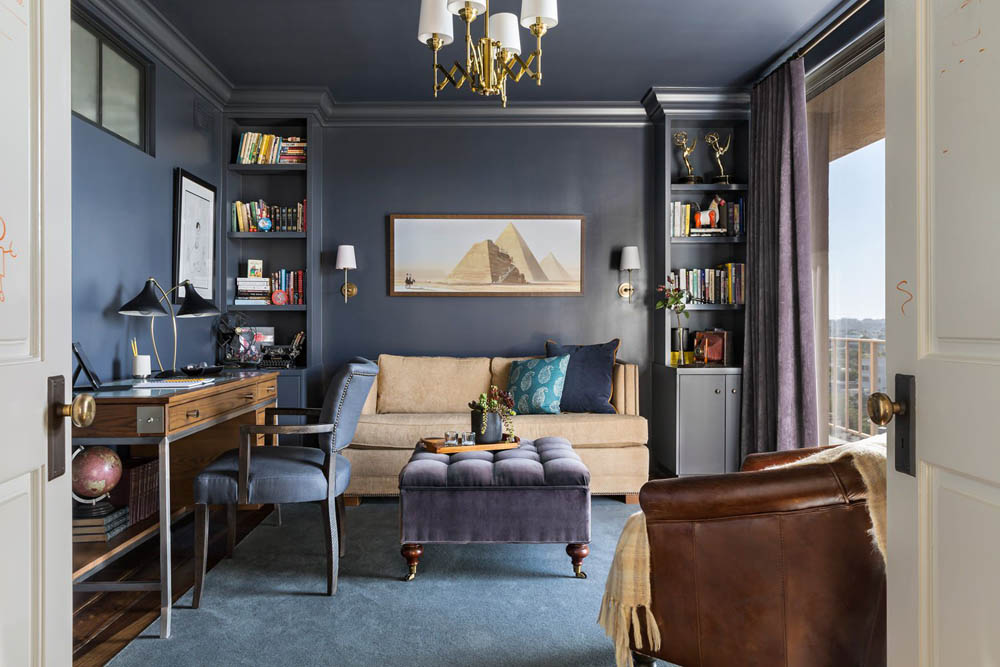
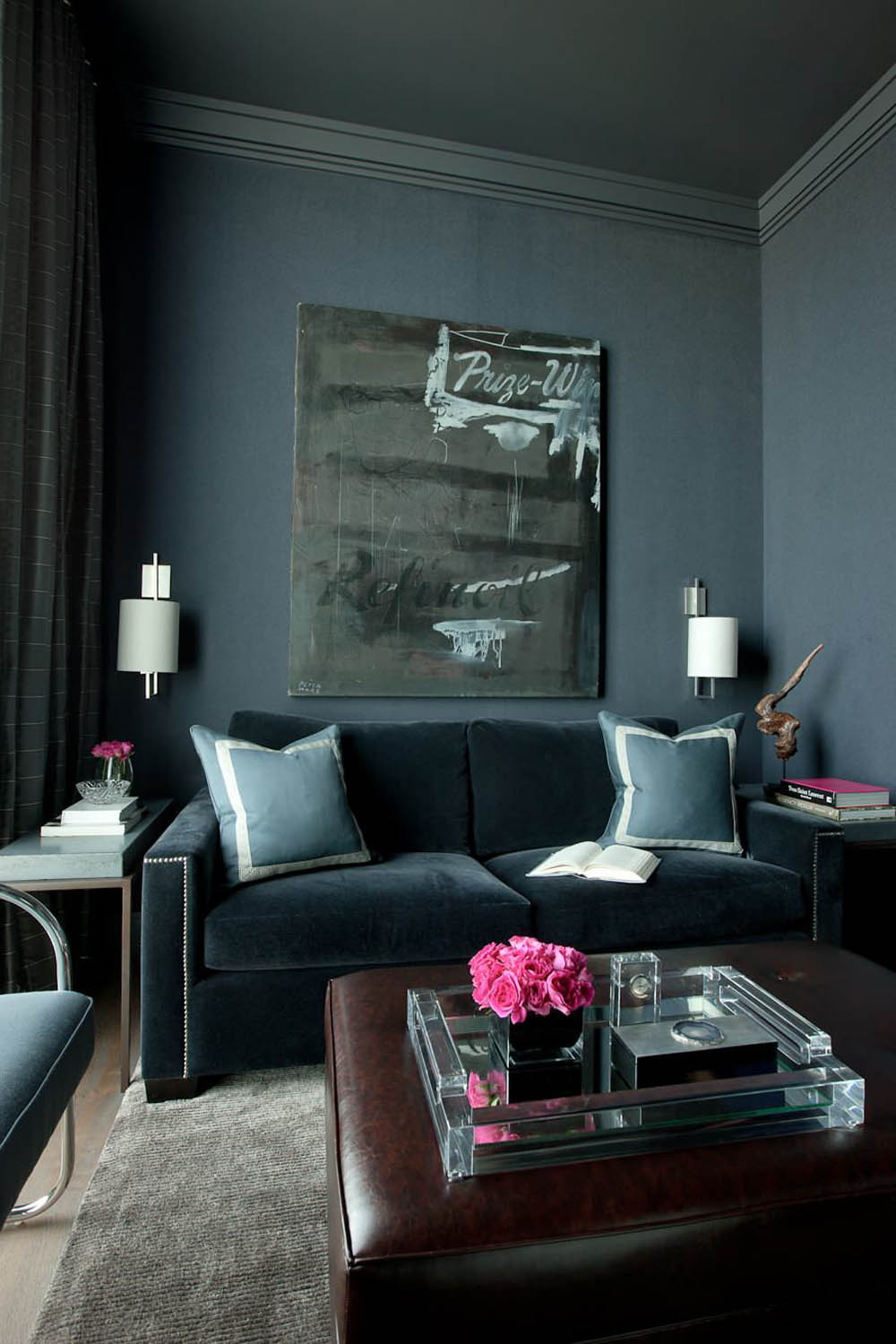
3. INKWELL BY SHERWIN WILLIAMS
This is a black paint color with subtle blue undertones that helps create that mellow snuggly feel to a space.
The slightly blue undertones are similar in all these almost black paints. These undertones aim to drift away from the harsh black and give it some life. When picking the right black, choose colors that have blue or brown undertones for softness and less intensity.
Combining dark paints with softer colors and wooden elements goes well. An example of this combination is this home office with a rustic feel.
4. BENJAMIN MOORE’S BLACK FOREST GREEN
Soothing, grounding, earthy and soft are some of the ways to describe the tones of dark green paints. They have become popular and are well-complimented with warmer and lighter colors. They are not that overwhelming and harsh to the eye so they give a space that natural feel to it.
Benjamin Moore’s Black Forest Green creates a dramatic first impression with its deep undertones of green. Unique organic jewel tones like Benjamin Moore’s Deep Sea Green, Slate Teal and Hudson Bay, are a suitable choice for both total room and accent wall.
These are colors that pull into a mystical atmosphere of serenity and sophistication.
5. BENJAMIN MOORE GENTLEMAN’S GRAY
Gentleman’s Gray by Benjamin is definitely a favorite pick. It’s a classy look, more dark teal than navy, so bright colors go well with it.
The new trends drift away from ‘safe’ colors and lean towards bolder palettes that reflect more personality and style. All this is influenced by the dopamine décor, which is the new feel-good trend. You’ll be awed by the outcome when using deep teals, rich dark reds and greens.
You must remember that using dramatic dark shades is committing so have to make just the right pick. The best way is to have as many samples as possible and even test them on your walls to see how they sit combined with other colors you want.
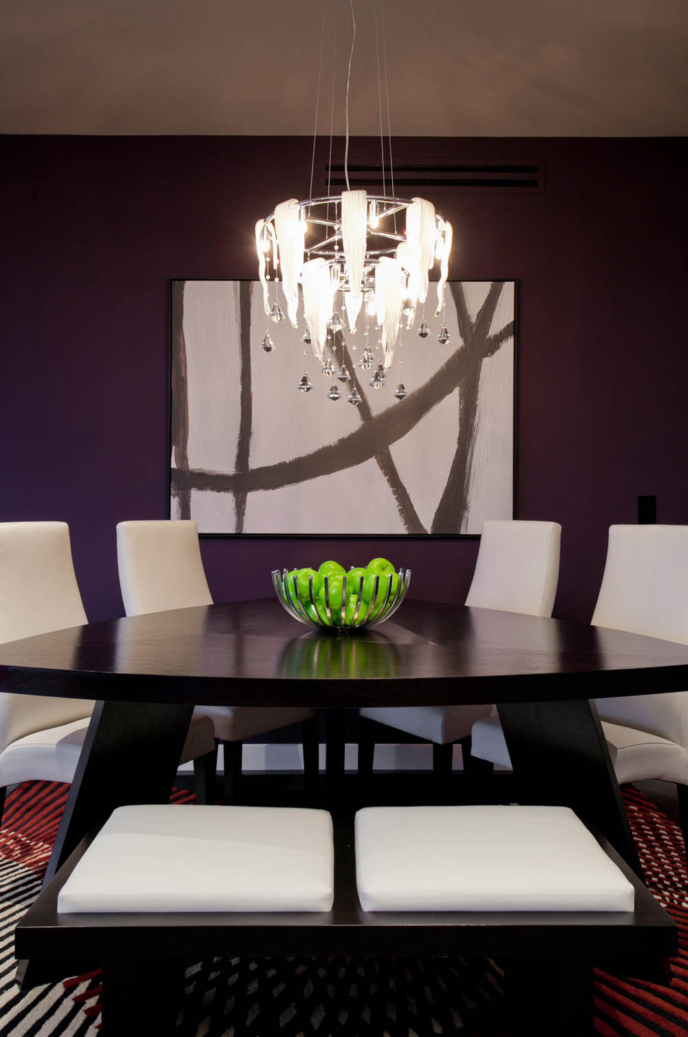
Which rooms you intend on painting are also to be considered beforehand. Darker colors suit small living rooms, snugs, guest houses and powder rooms. With these shades areas such as your living or dining room can have a much warmer feel, not to mention what a fantastic upgrade your kitchen cabinets can have with a new darker shade.
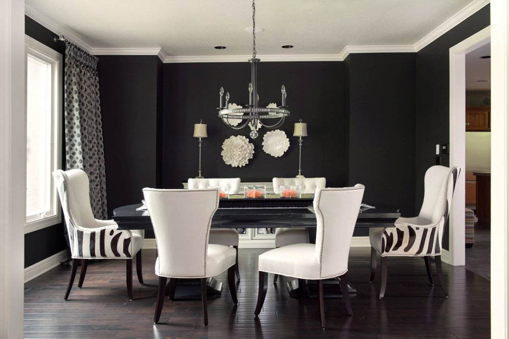
6. FARROW & BALL WITH OFF BLACK
via Kathleen Ramsey
Off-Black is a sure bet by Farrow & Ball. It is a warm deep gray, a gorgeous soft black less blue than Railings. It’s the perfect accent to that soft warm whites, like this kitchen color scheme. It gives contrast without an otherwise harsh black hue.
Farrow & Ball’s also offers softer alternatives to pure black like No.57. It has warm undertones settling in the affinity of sung. An earthy black is the Sherwin-Williams Urbane Bronze (SW 7048), it contains undertones of rich brown and grey. It’s a hush of sophistication!
7. FARROW & BALL PAEAN BLACK
via Chris Jovanelly Interior Design
A melodramatic statement is going for Farrow & Ball’s Paean Black. It has a hint of red to give it that sassy glamour feel, especially with high gloss.
Going dark and bold with Williams Tricorn Black is also a good choice. Surprisingly enough dark colors can be used for space expansion just like light ones so don’t fear opting for one.
If you think they might make a space appear claustrophobic, here is something to consider. Dark colors can absorb light, creating depth and dimension by blurring edges. So blur your edges and you’ll be amazed at the result!
Feel alive and take a dive to your dark side! You’ll be marveled!