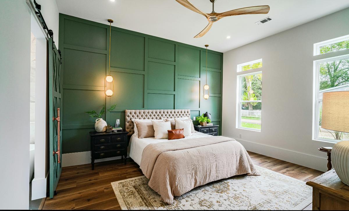
There are plenty of design choices to your interior that can be hit or miss and are worth experimenting with.
There is, however, one, which is just so essential it makes or breaks the look of your home.
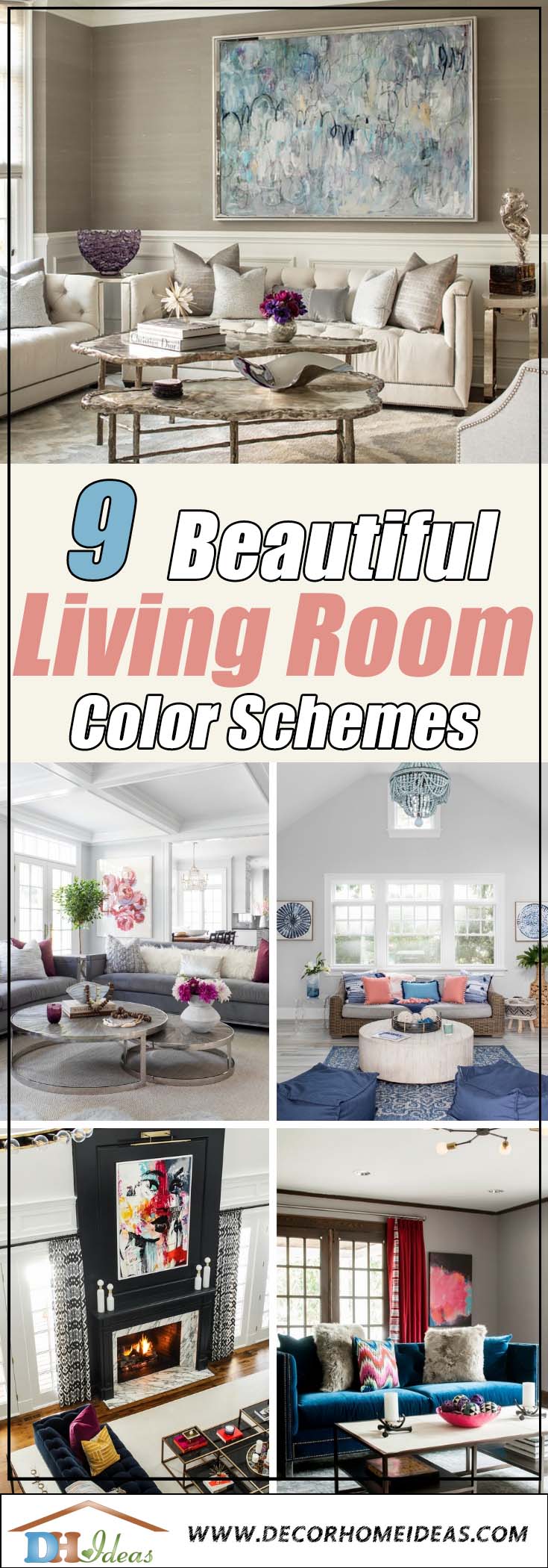
And unless you only see in grayscale (and probably also then), you already know what we are going to be talking about in this article: colors!
Color creates the atmosphere of your home more than anything else.
Choosing colors for your living room only means you have to choose colors you are going to be looking at for most of the time spent at home.
Tip: Check for FREE how much it will cost you to paint a room in your area HERE
So pick carefully! Oh, you also have to combine different colors, so they bring out the best out of each other and don’t look like a mess together.
Scary, right?
Don’t worry, though.
We made a list of great living room palette suggestions for you to use.
You can either take the ideas and apply them or draw inspiration and come up with your own visual style.
1. Transform Your Space with Chic Wall Art and Neutral Accents
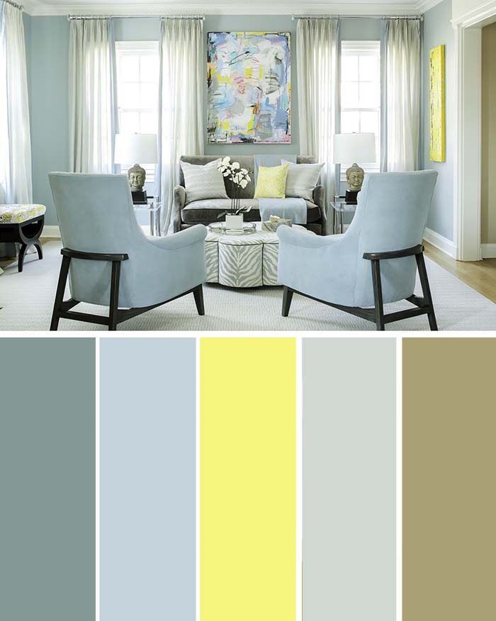
The fresh lemon yellow appears in small splashes straight from the wall art into this room.
It is complemented by the otherwise neutral color scheme, which helps it stand out, shaping the mood for engaging conversations in this sunny living room.
The choice of armchairs is adequate as they look both fashionable and relaxing.
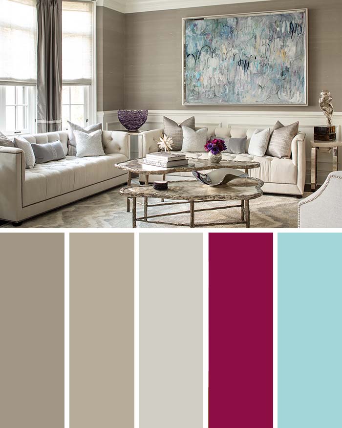
2. Create a Fairy Tale Wonderland with a Living Room Palette
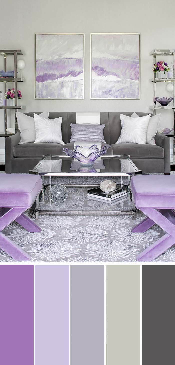
If you were not born to a king and a queen in a remote kingdom, you can still turn your dreams of a fairytale life into a reality, given you pick the right colors.
Like a combination of dreamy purples or pinks and calm contrast colors. The brown and beige serve the purpose of not letting the ‘fairytale’ nuance get overwhelming.
The plush furniture is an ever-present accent across the room, but the two part canvas on the wall steals the show resembling a portal to a fabled dimension.
It gives a clear center to the room and draws most of the attention.
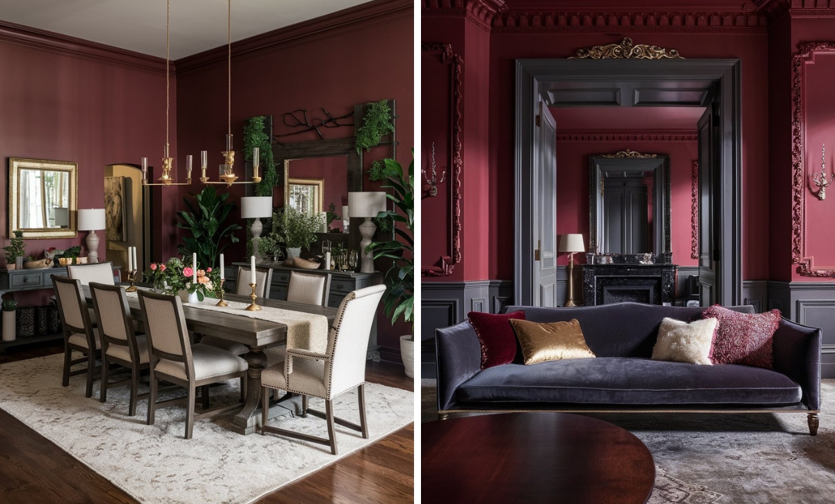
3. Brighten Up Your Space with Contrasting Accents
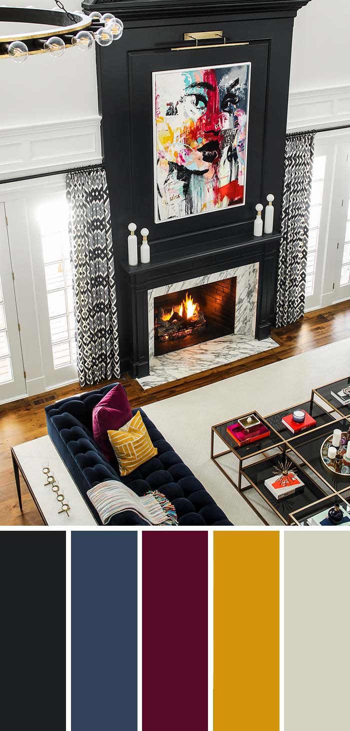
Dark walls or furniture elements create a strong contrast to plain white walls, which translates into a sharp modern look.
The wooden floor in this picture adds a splash of color to create some middle ground with additional color spots throughout.
There is still a clear distinction between the lighter tones of the walls, paneling and carpet, and the darker tones of the fireplace and furniture.
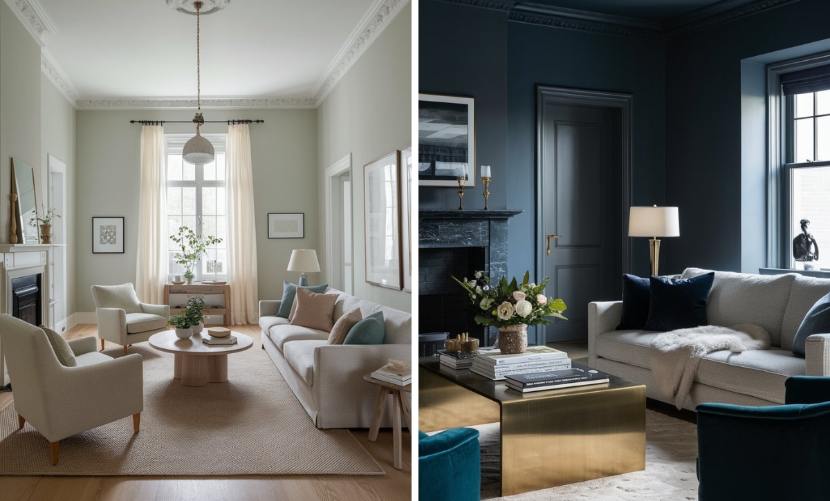
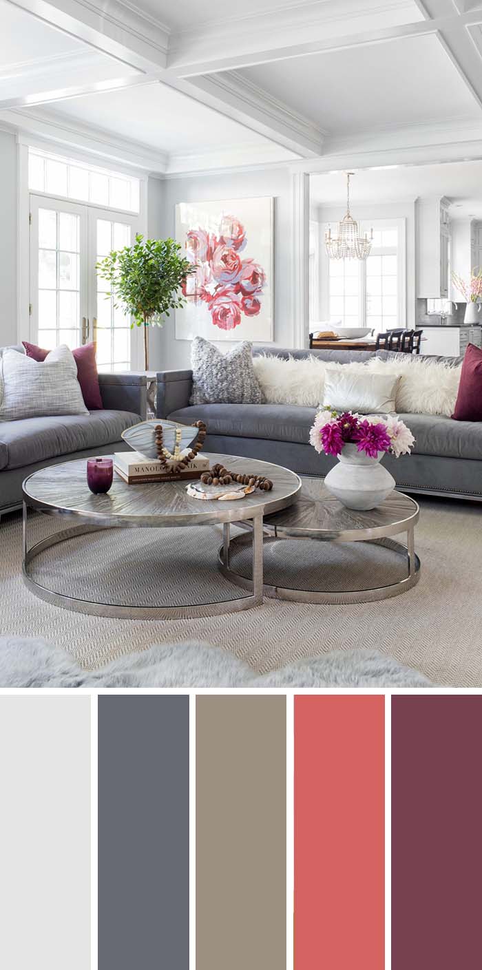
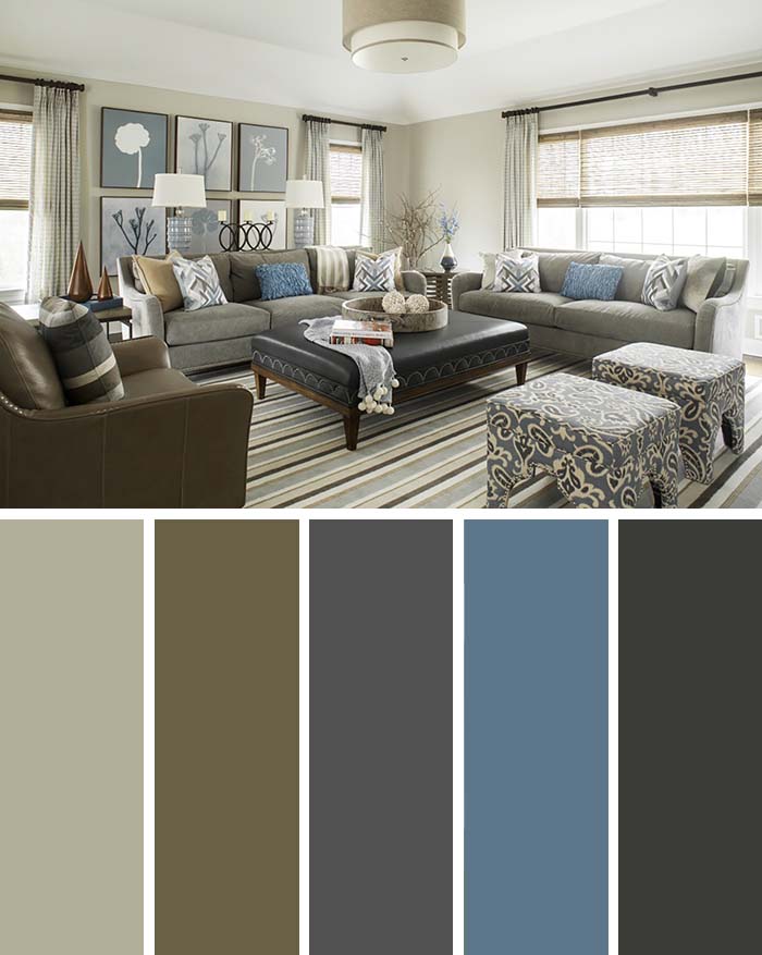
4. Find the Perfect Balance with Soft Earthy Colors
All elements on Earth are contained in its crust just as the entire room in the picture is painted in soft earthly colors: brown and beige.
Upon entering the room a visitor immediately feels calmness and relaxation, emphasized upon by the soft and cozy furniture, but also solidity and seriousness, stressed upon thanks to the wainscoting, tall walls and expensive-looking table.
Three elements balance the setup: the huge painting with its pastel nuances, the glass bowl and the fresh flowers in the table.
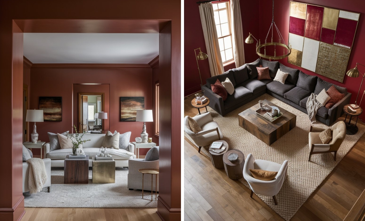
5. Bring Vibrancy with Bright and Neutral Colors
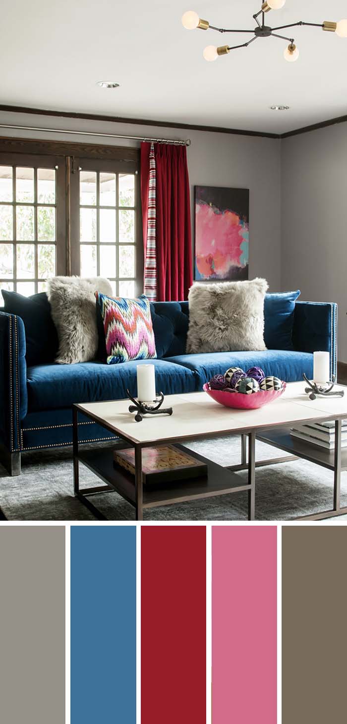
Above we saw some homes with color effectively utilized as an accent.
Here we see a home where color is king. And that is quite the difference.
Pink, blue and red are surrounded by more neutral colors, but not swallowed by them – each is entitled of its own spot in the room in both the furniture and decoration.
The main difference with the photos above is that the blue sofa and the red curtain are actually the sights which a visitor would immediately see and remember.
The feel of this home is one of style and confidence, but also comfort in one’s own skin and the authenticity of an actual home people live in.
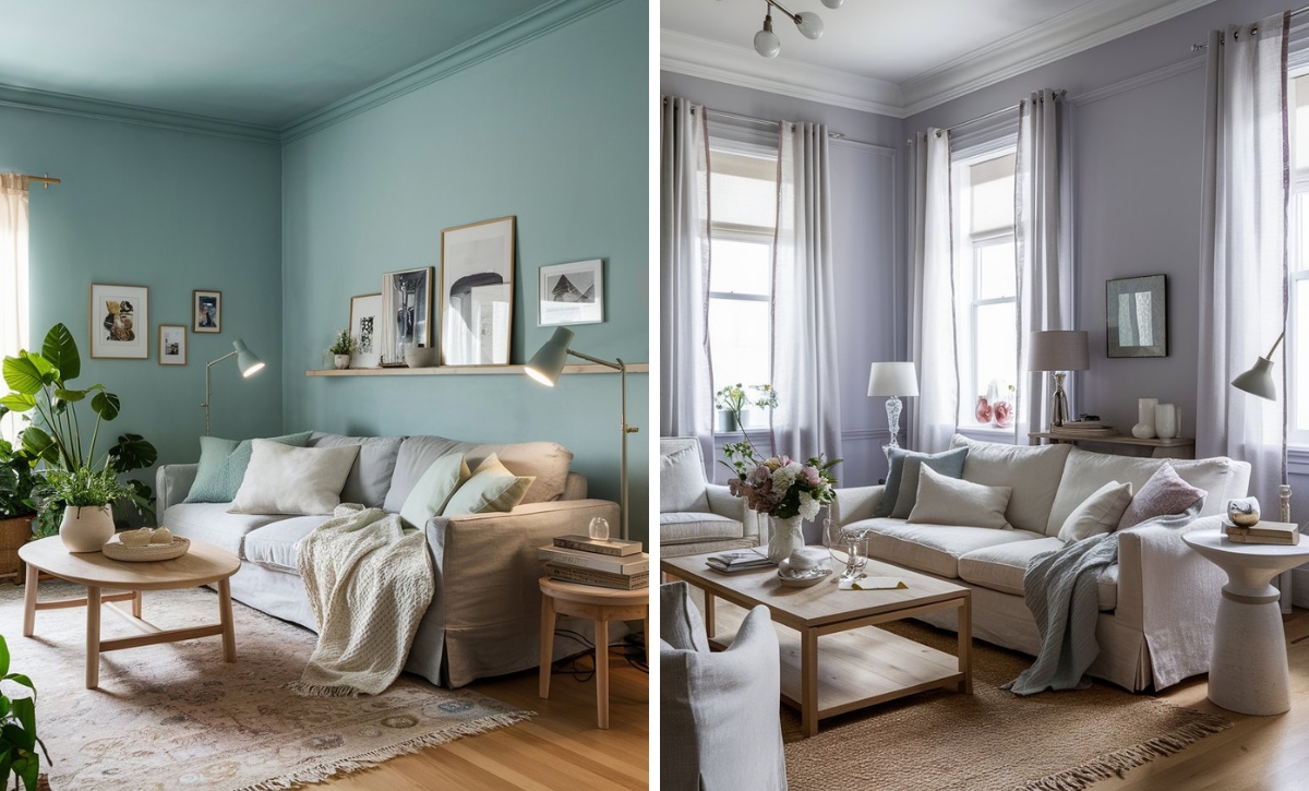
6. Accentuate Your White Decor with Neutral Color Furniture
This room relies on a light palette to look spacey and nice.
The grays are different shades and not matched with each other, which creates a seemingly negligent look.
However, the details such as the identical red pillows show the actual consideration that was put into the interior.
Surely not a slick modern look, but the design uses that to its advantage as it helps it look cozier.
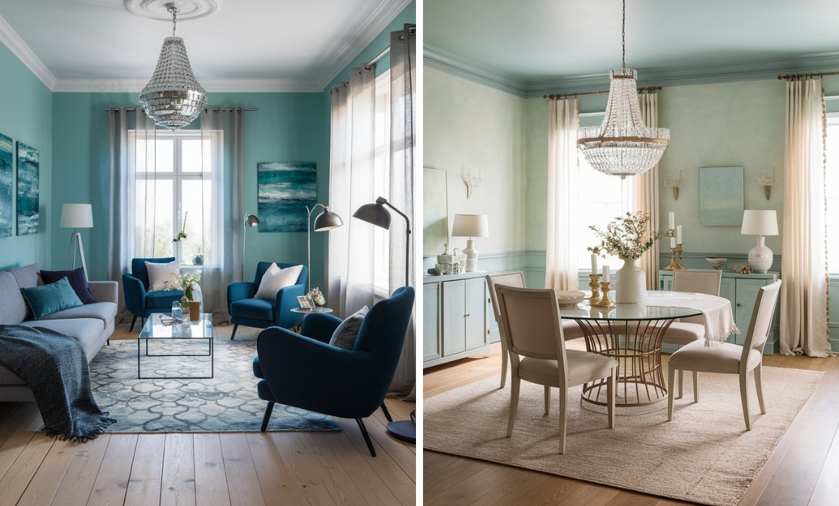
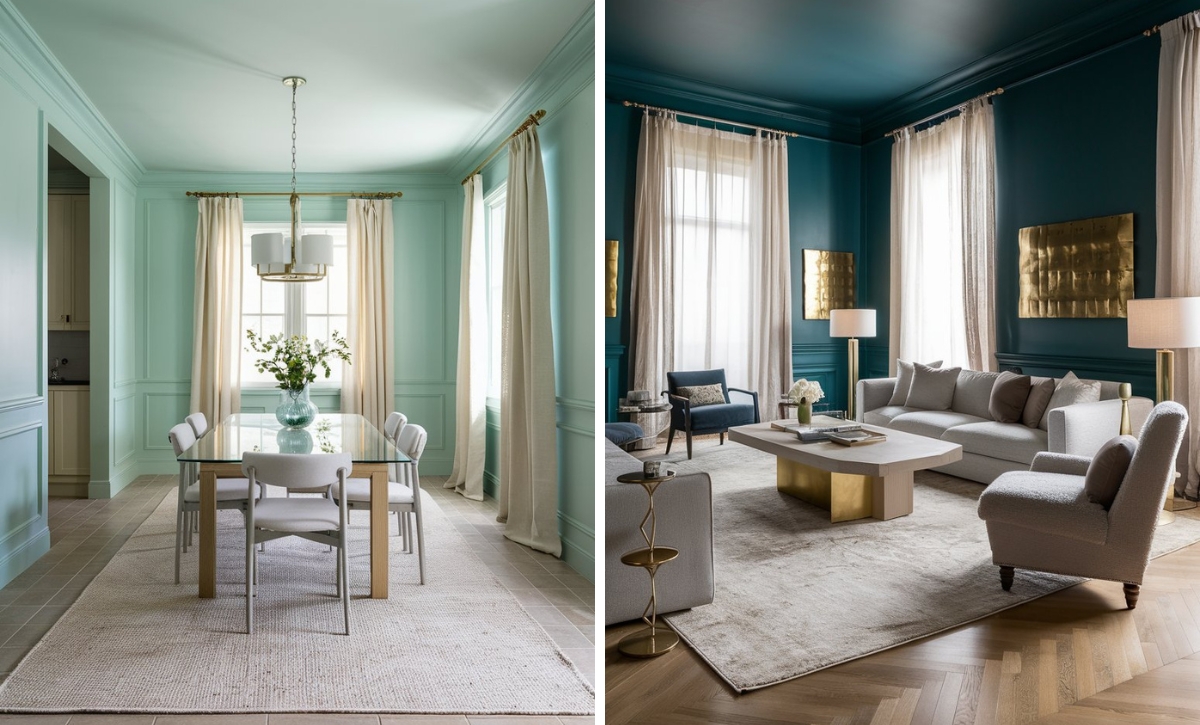
7. Make a Bold Statement with Coastal Colors
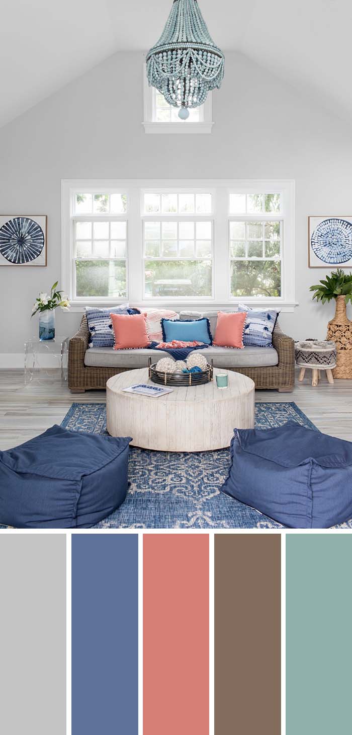
Welcome the seaside in your living room by completing the interior with these colors, which resemble the image of Summer warmth, refreshing seaside breeze, waves and salty foam.
This interior combines chic with its specific shapes and its Byzantine blue, and the unassuming living of a bungalow by the beach.
The furniture uses light and simple materials and lacks pretense.
Much of the effect is created by its simplicity, mixed with the clear direction of the color palette.
Also, the coral pink is nicely added as a counterpoint to all the blues.
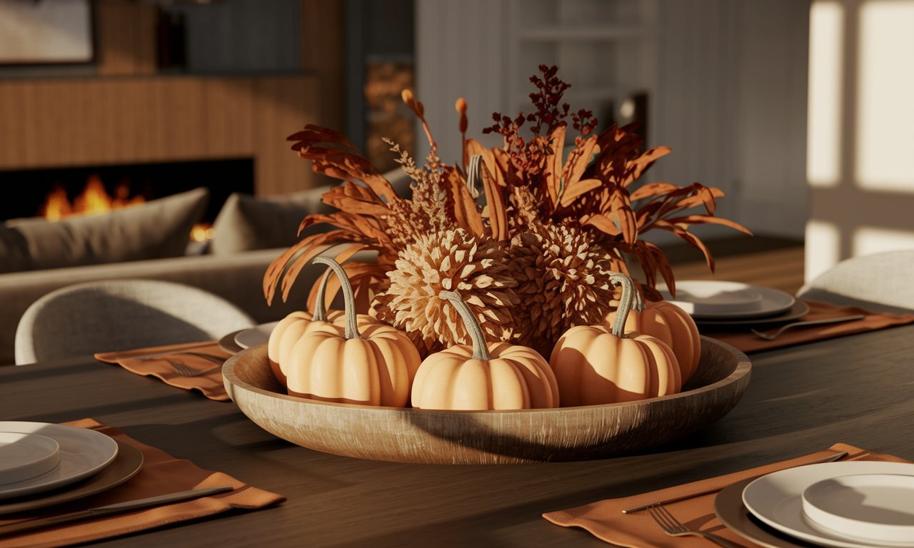
8. Upgrade Your Home’s Aesthetic with Caramel
The caramel palette of this home reminds of old times, memories, but also high standard of living.
It is well lit and the walls reflect the light beautifully onto the darker surfaces.
Plenty of patterned pillows, a patterned carpet and various ornaments keep it interesting, while not necessarily motley.
The colors at place are related to the colors in nature.
They naturally flourish under the sun rays coming in through the huge windows, and give us the pleasant feeling of a Fall afternoon spent hiking outdoors.
9. Get the Look of Luxury Living with Patterned Accents
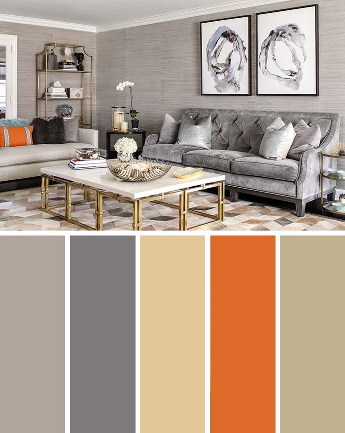
Gray, brown and beige are easy on the eyes and the mind, but everybody needs a little color to keep things lively.
While orange doesn’t stray away from the reddish gamma (in which browns also find their place), its bright and signaling shade definitely draws attention.
The room in the photo looks stylish and smart without too many bold choices, but also inspired as it lighthearted bright shades and rich dark shades coexist harmoniously.
The orange comes as a reminder its owner also has a wild side and doesn’t mistake having a slick style for only surrounding themselves in earthly tones.
These great living room interior designs are created by Karen Wolf Interiors and they have a lot more to show you on their website so if you need more inspiration visit them.